UX/UI tips for application controls
Lesson 1: Lists
Good data lists allow users to scan, analyze, compare, filter, sort, and manipulate information for insights and perform actions. These basic design guidelines help you create optimal data lists.
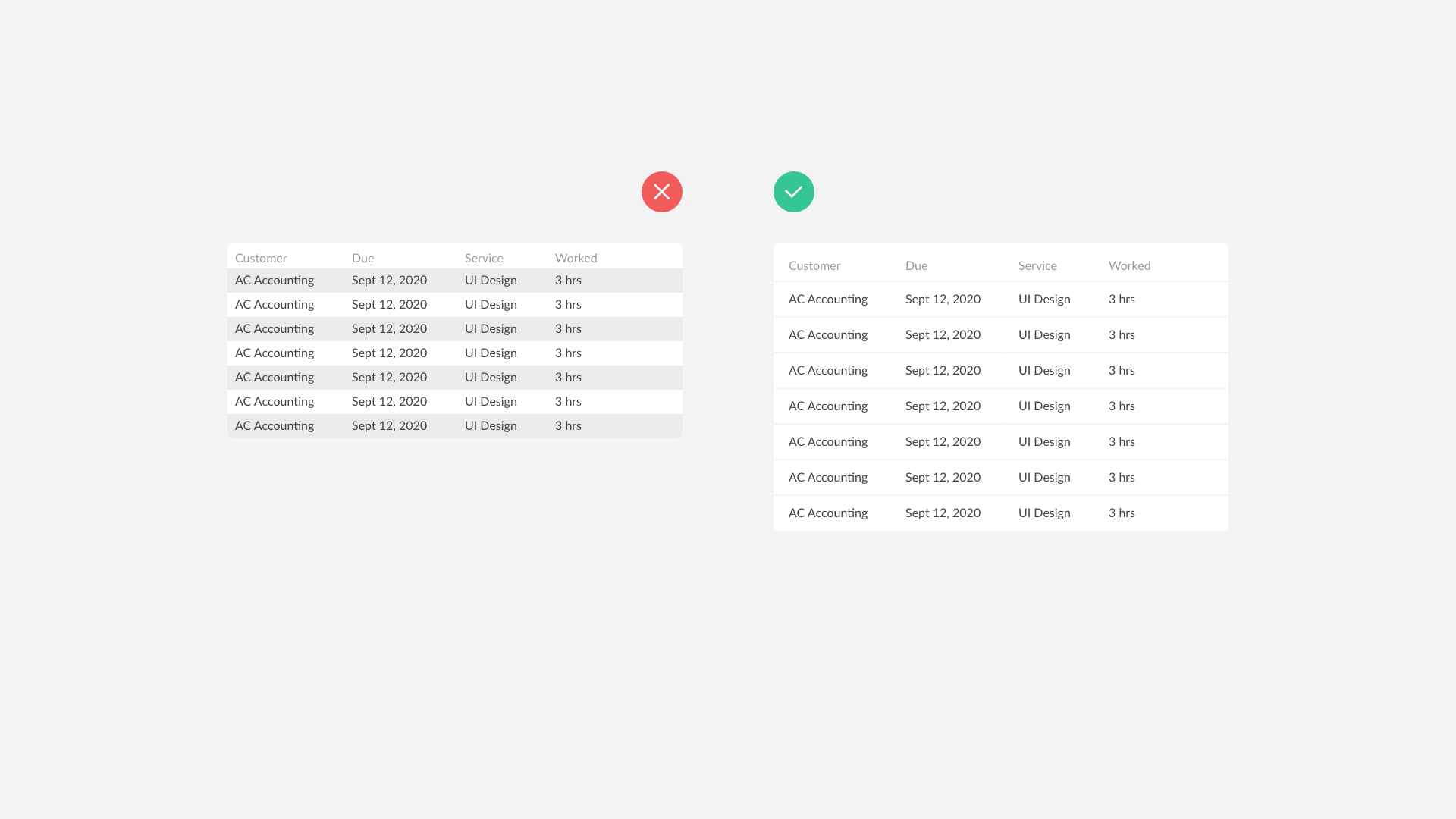
- By using a separation between list items, with a 1 pixel solid line, you create structure and clarity for your user. It allows them to quickly orientate and identify where they are in the list.
- Use a row padding of 12 pixels allowing a user to scan and read the data better.

These are the basic design guidelines for a list. In the next short video, we discuss Views!
