To continue with this content, please log in with your Data Access ID or create a new account.
Cancel Data Access ID
You may not be authorized to see this content. Please contact Data Access Europe for more information.
Cancel Data Access Europe
You are not authorized to see this content.
Cancel Data Access Europe
Next lesson:
Icons
Cancel

UX/UI tips for application controls

Lesson 4: Buttons

A button is a fundamental control for any application. They allow users to interact with the UI, select options and make choices.

When it comes to UI design guidelines for buttons, the most important thing to focus on is the button’s purpose and make it look clickable. These three basic design elements help make perfect button design.
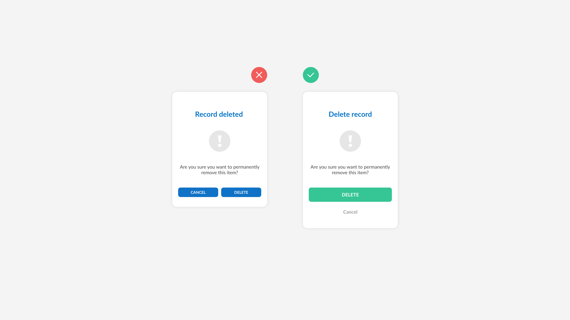
  1. Use a height of at least 42 pixels
  2. Use contrasting colors
  3. Use a padding of at least 8 pixels

This concludes basic design guidelines for buttons. In the following short video, we discuss Icons!