


Hierarchy is one of the best principles to help users move through an application fast and easy for a better experience.
Hierarchy, often referred to as, visual hierarchy, relates to the visual appearance of content. This principle helps making navigation easier and more intuitive.
One of the most important rules of hierarchy is to make sure important content stands out. One example is making headings larger than body text. Another, is the use of signal colors for interactive elements, like a button. Use an attractive colors to draw the user’s attention.
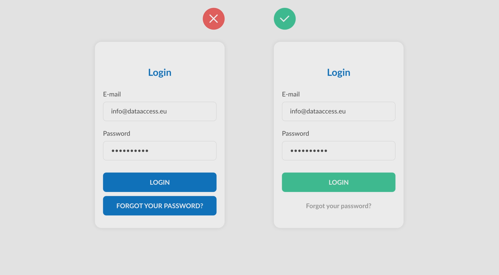
Let’s look at three hierarchy examples.In this example we are using green as a signal color to focus on the primary button. This focus leads the user to the desired target. The secondary button is shown as a normal text link to get less attraction.
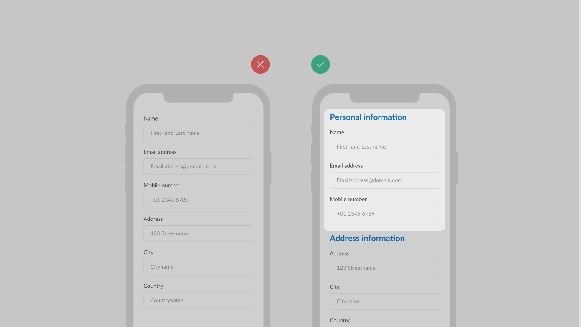
 This mobile form shows that arranging and grouping your input fields makes an organized form. This makes it easier for the users to complete.
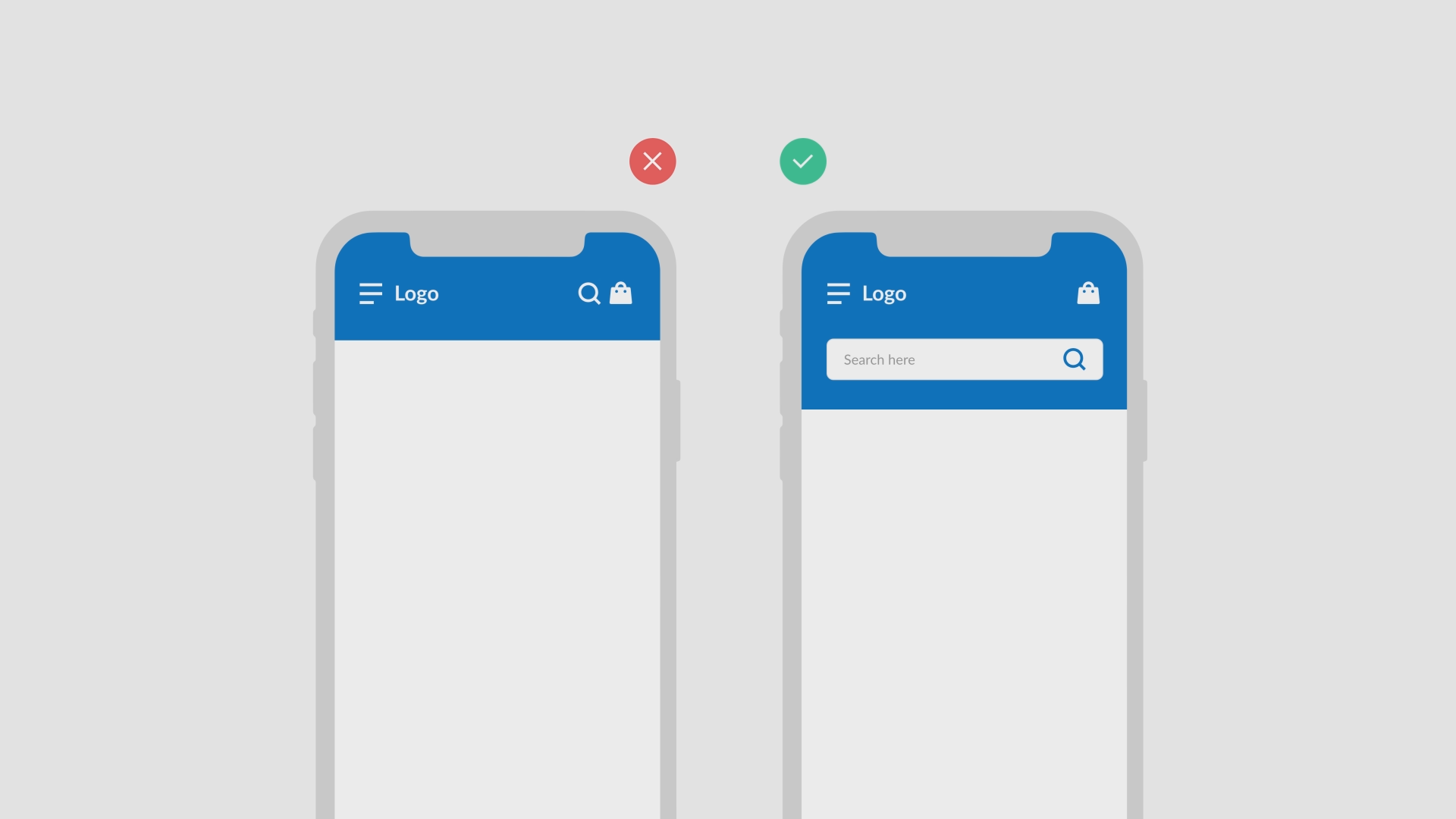
 The search function is a very important function for e-commerce applications because it has a high conversion rate. Giving more attention to the important functions makes them easier to access.
 That covers the key elements of the principle: hierarchy, visually emphasizing important content of your application for clear navigation and a better user experience. In the next lesson we will discuss Consistency!
