


Users expect applications to be consistent. The more familiar your applications are, the better their experience will be. This is great news for designers and software engineers because it means you can use your applications to maintain the same standard patterns providing a consistent familiar look and feel. It might be tempting to try something new, but the principle of consistency (and there is a lot of research) shows us it is better to stick with the standards.
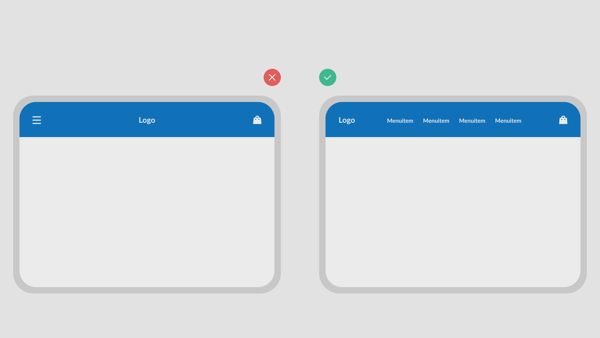
So how do you use these standard patterns in your own application? Everybody knows the standard patters, right? The navigation for an application is ALWAYS placed on the top or the left of the screen. The shopping cart is ALWAYS placed on the top right and a logo ALWAYS on the top left. The only thing you’ve got to do is to stick with these standards throughout the entire application.
Users expect your logo in the top left of your desktop application. Use these standard patterns to make it recognizable for all users.
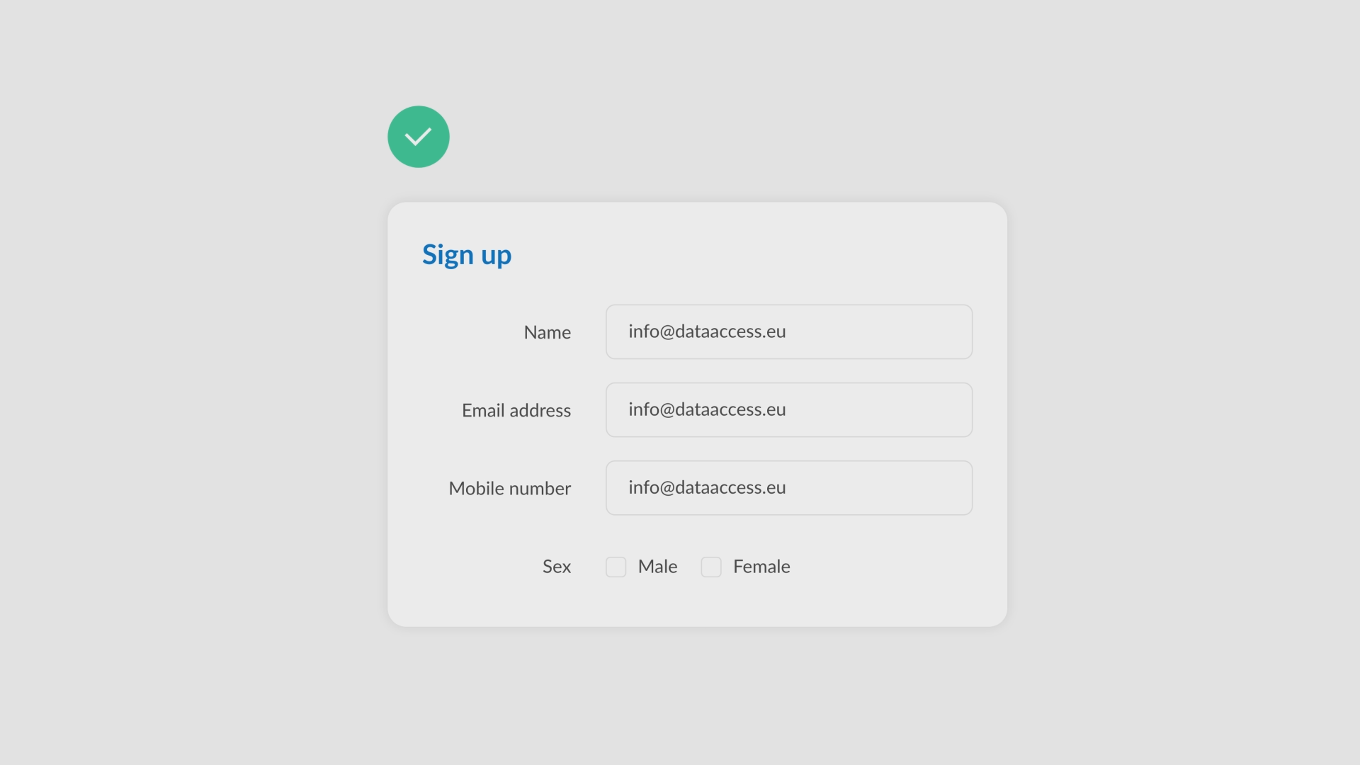
 Make sure your labels text is right aligned. This makes it way easier for your users to scan your form.
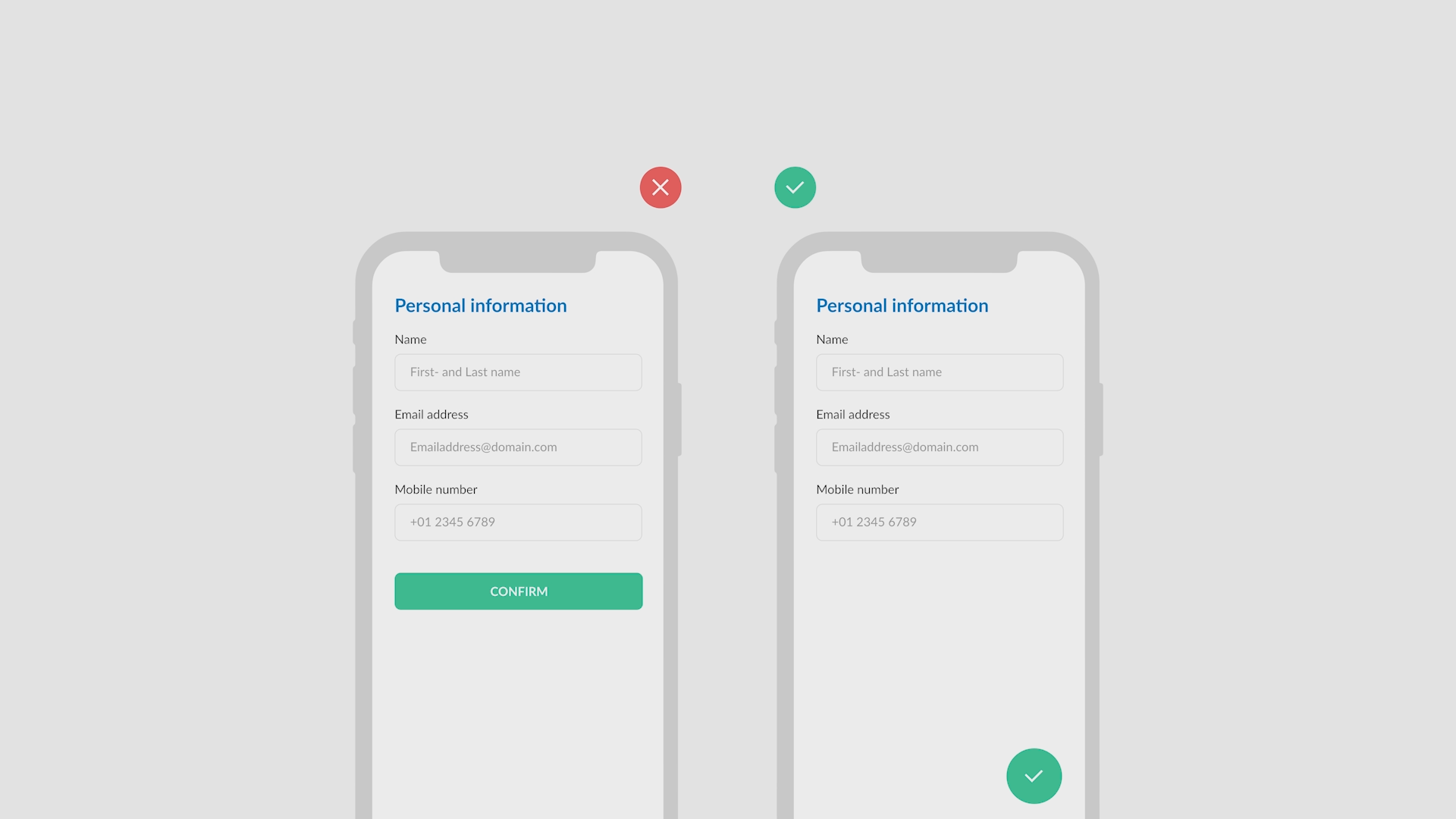
 A lot of mobile applications are using a floating action button for a primary function. This buttons is also known as a FAB. Start using this button to be consistent with other mobile applications.
 Well, that’s all there is to know about consistency. A principle to improve the user’s comfort and familiarity with your application. In the next lesson we will discuss Confirmation!
