


Our last principle is Accessibility. Our goal is to create applications that can be easily used by as many people as possible.
It is important to focus on removing obstacles for people when they use the application. Accessibility improves the user experience for all because it forces us to create the most usable, clear and straight forward applications possible.
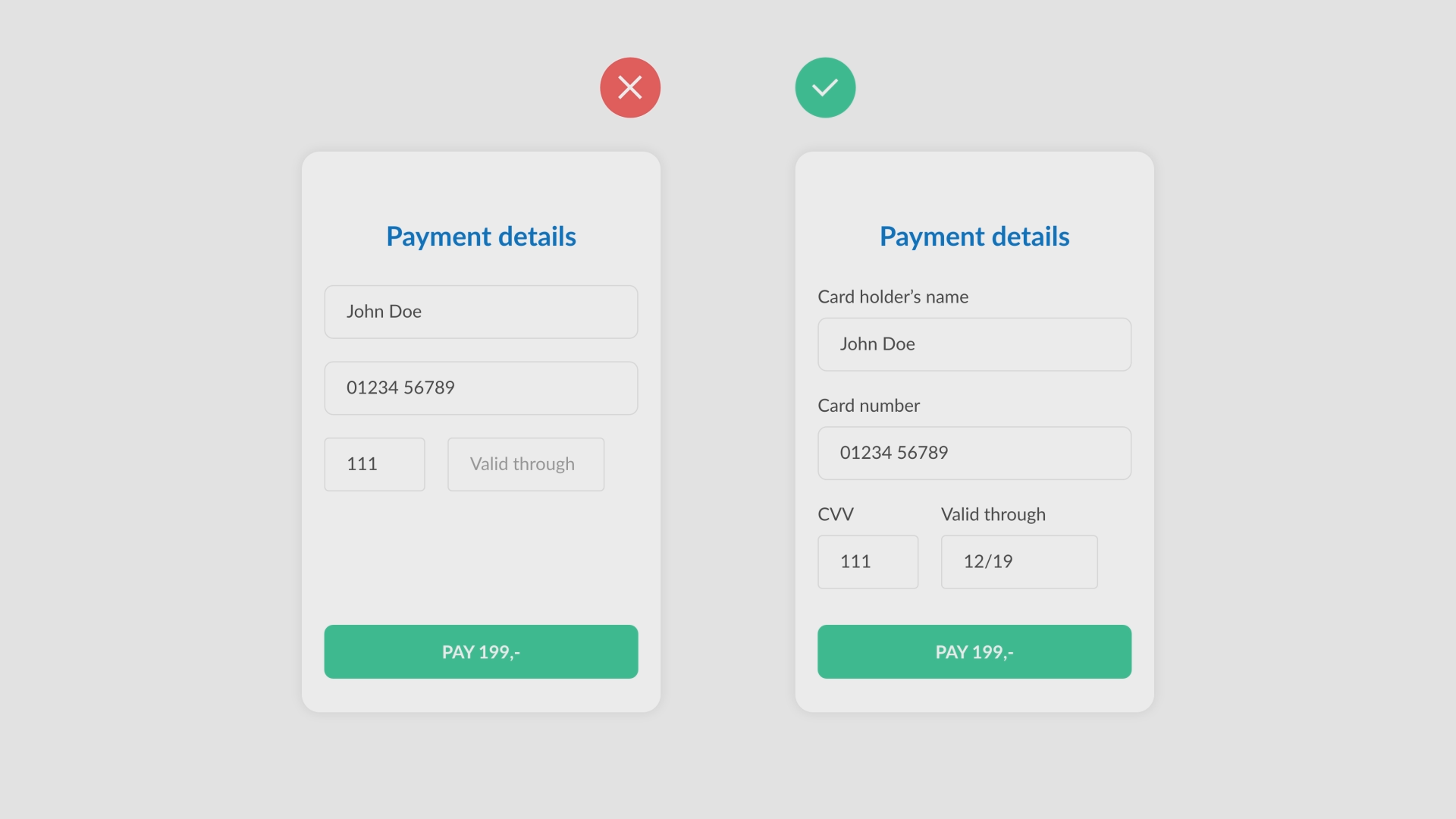
One of the most important examples is placing labels next to input fields. It identifies clearly to the user which information is required in each input field.
Let’s look at three Accessibility examples.
This form shows one of the most important rules to know when building an application. Always use labels. They identify clearly which information is required in each input field.
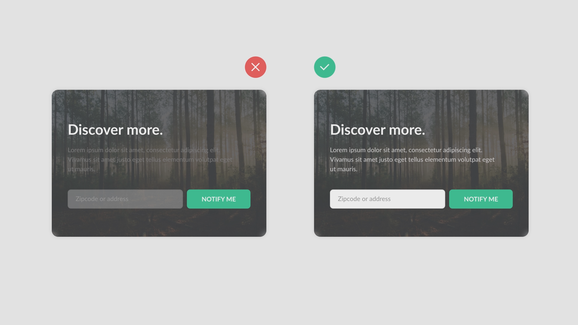
Make sure all your content is easily readable. When the contrast of content is not high enough, users can’t read it or know how to use it.
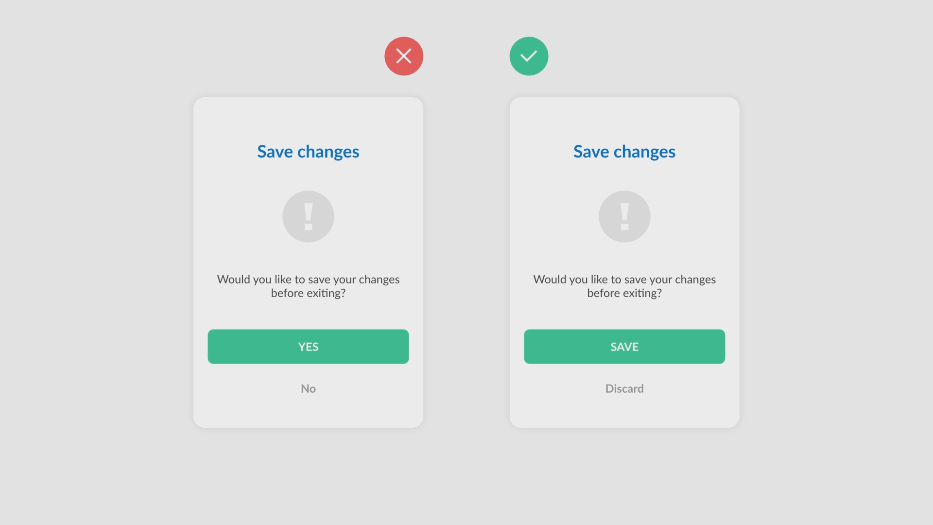
This example shows good usage of action verbs. The verb “save” gives the user way more clarity about what they are about to do then the verb “Yes”.
That wraps up the Accessibility principle. A principle used to create clear and easy applications that anyone can use.
In this course we’ve discussed five basic UX/UI Design principles that are useful when developing an application. These five principles are:
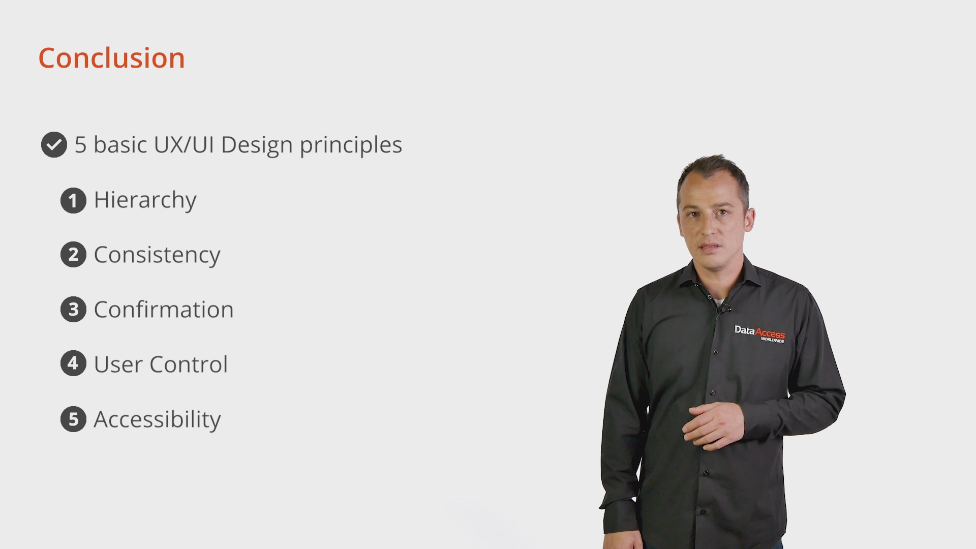
It has been a pleasure sharing this information with you. I hope that you will find these five principles as useful as I do, when designing and developing new applications.
If you have questions about UX/UI design in your DataFlex application: feel free to contact me
