
 REFERENCE LIBRARY


In this lesson, we will explore the built-in responsiveness features of the DataFlex Web Framework, allowing your applications to adapt to different device sizes.
DataFlex offers various responsive modes, including desktop, tablet (landscape and portrait), and mobile (landscape and portrait). These modes automatically adapt your application based on the detected device size.
The Framework automatically detects the responsive mode based on screen width and aspect ratio. For example, tablets are detected when the screen width is below 1100 pixels, and mobile is for screens below 580 pixels.
You can set responsive rules using the "WebSetResponsive" command. This command allows you to change control properties based on the responsive mode, ensuring your layout is optimized for different devices.
Use the "pbRender" property to hide controls on smaller devices. For instance, you can set "web responsive pbRender on mode tablet portrait to false" to hide a control on tablet portrait and mobile devices.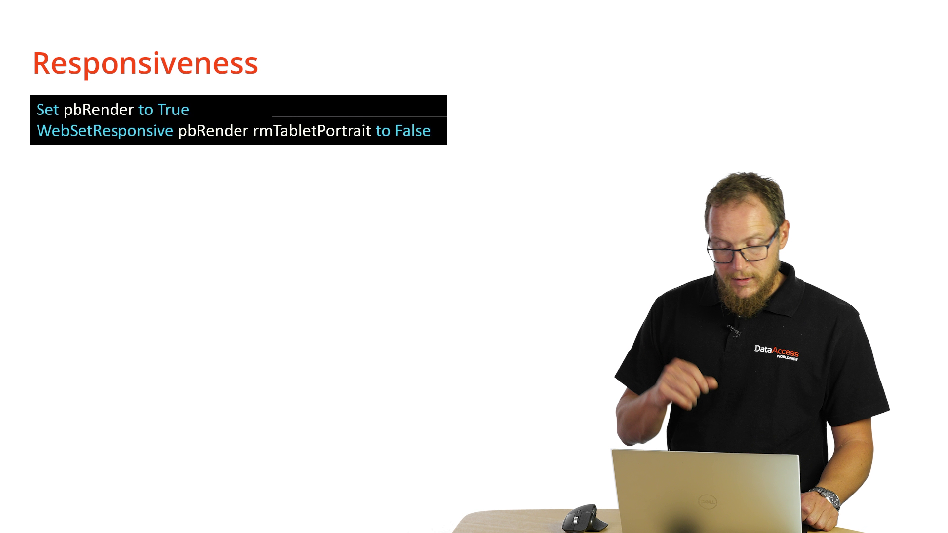
You can apply multiple values based on different responsive modes. For instance, adjust the column count for better responsiveness by specifying different values for desktop, tablet, and mobile modes.
Decrease the column count for controls to stack vertically on smaller screens. For example, change the "piColumnCount" property to 6 on mobile devices to have fewer columns.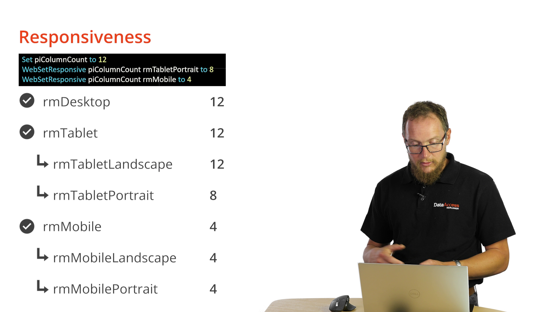
Adding WebSetResponsive piColumnCount rmMobile to 6 to our application looks like this: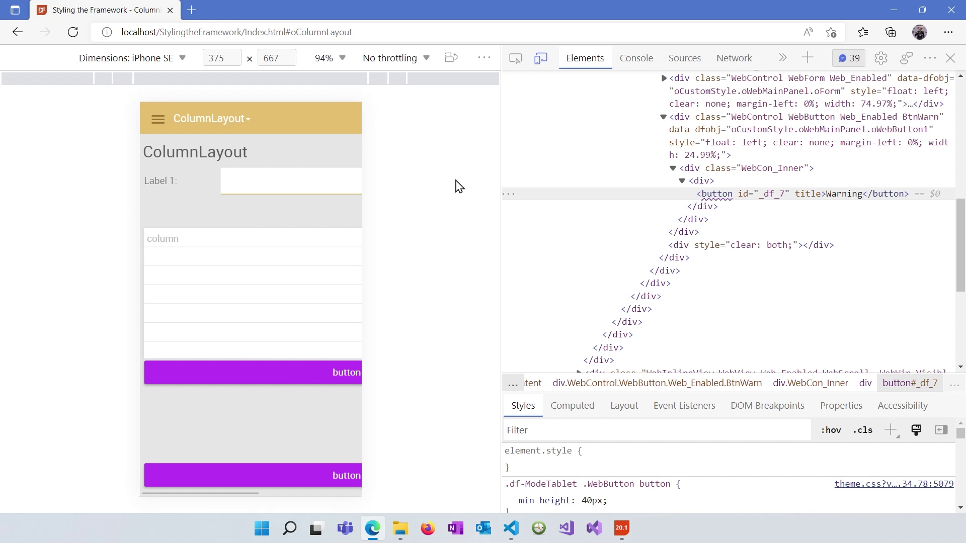
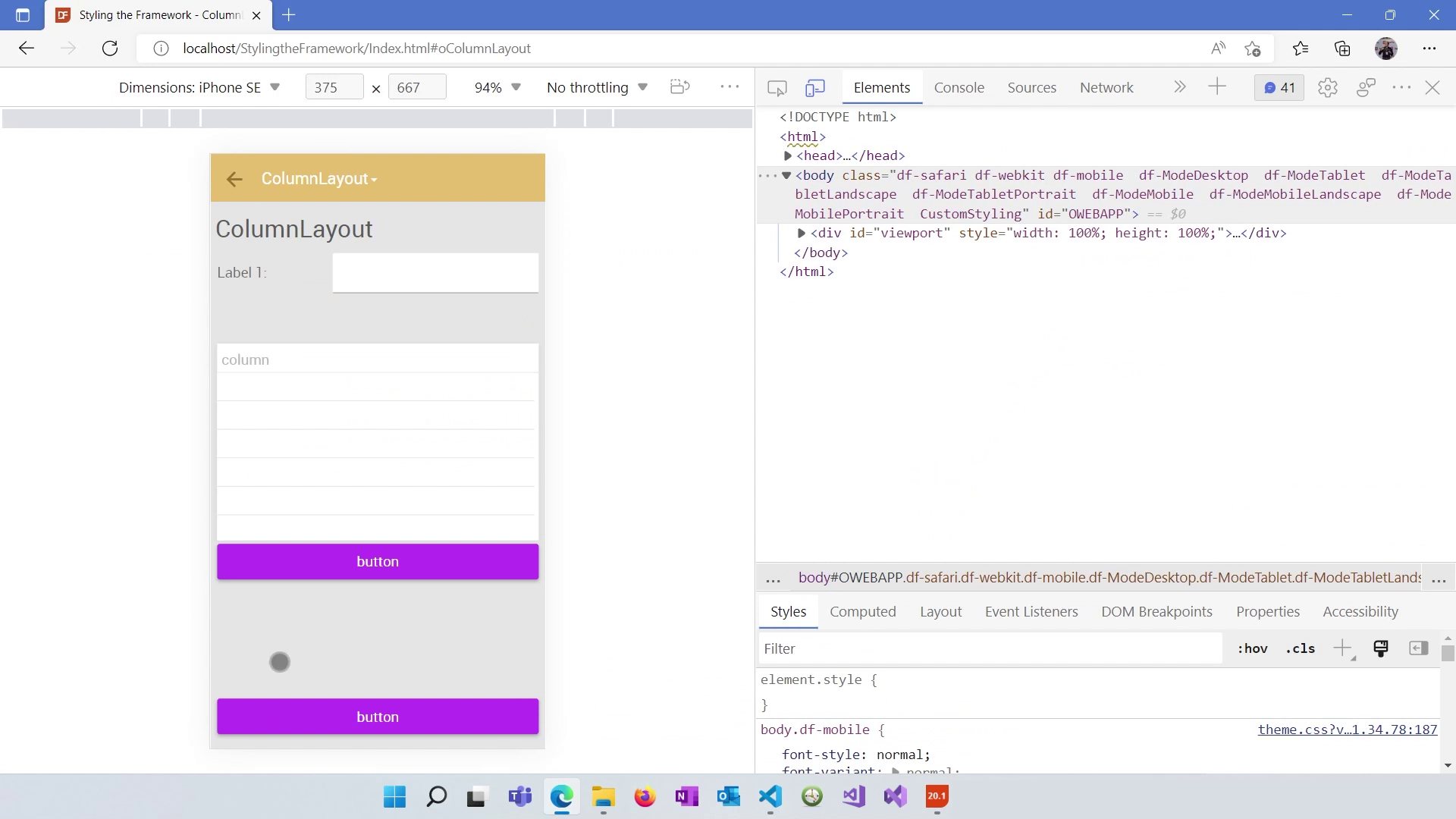
To test responsive layouts, use browser developer tools to emulate different device sizes. You can see how your application adapts in real-time.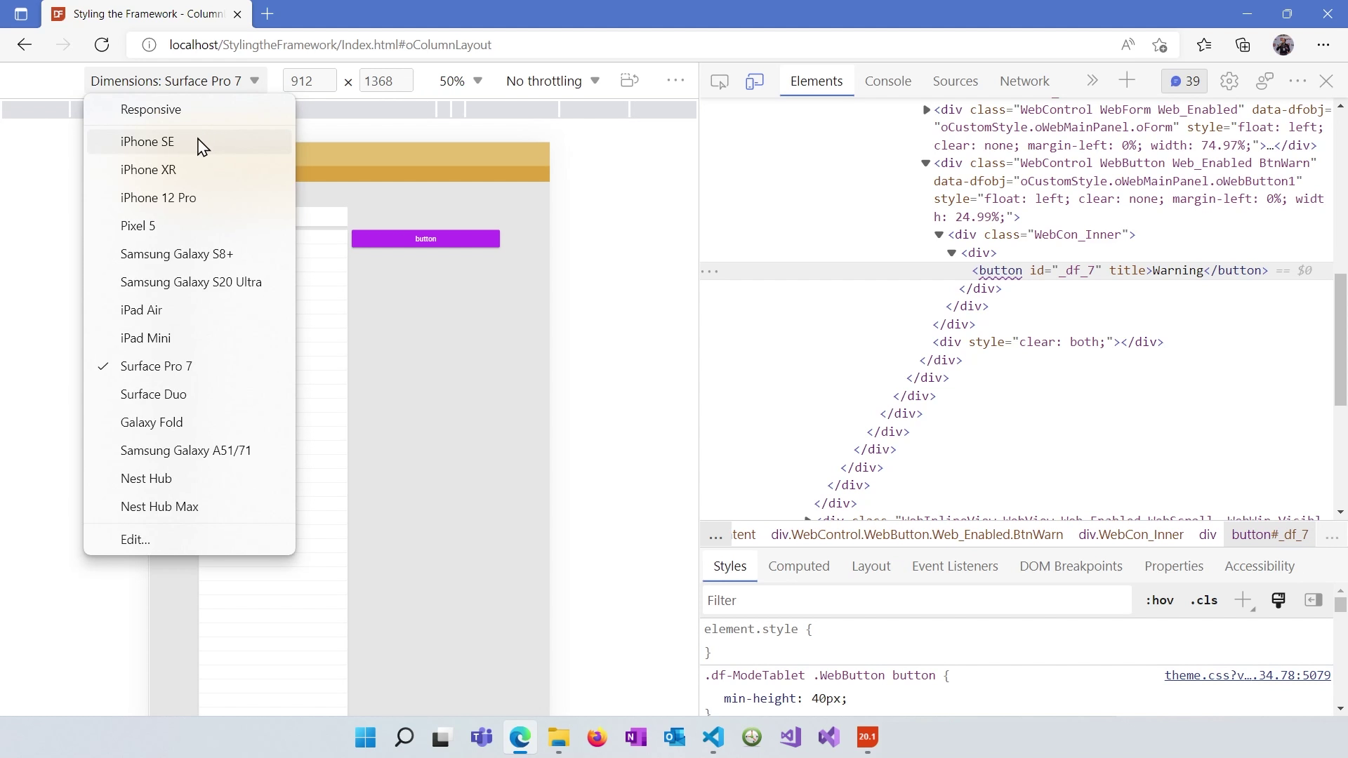
Set the "max width" property for your view to ensure it doesn't exceed a specific width. This prevents horizontal scrollbars on smaller screens.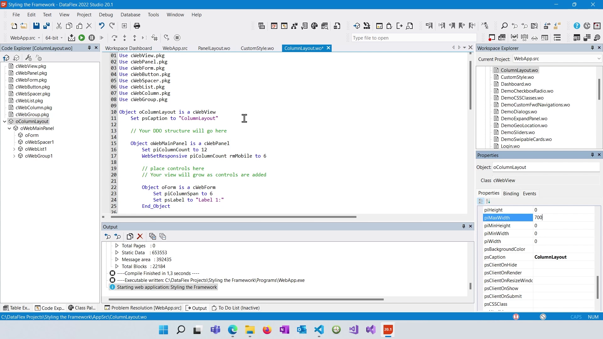
Now all elements fit nicely in the screen:
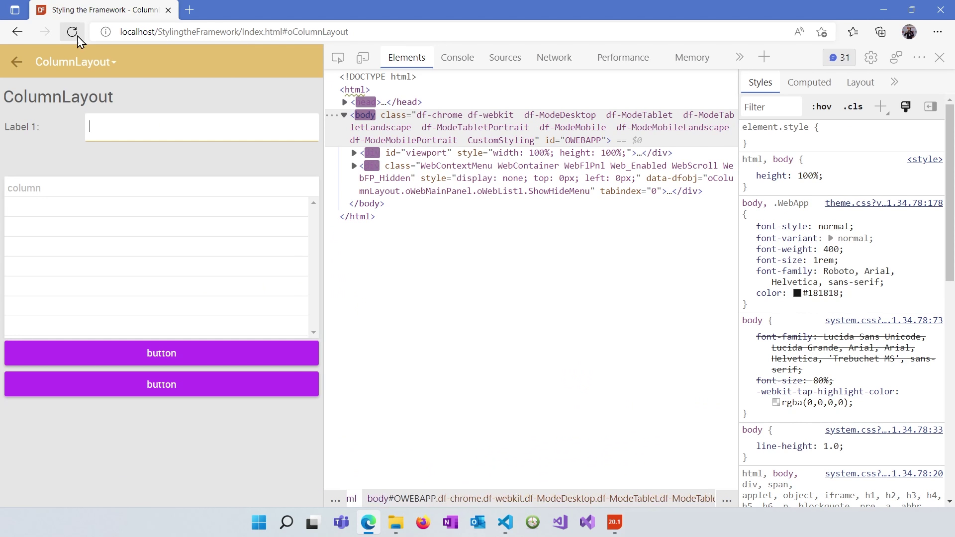
Hide spacers or other elements that create unwanted whitespace on mobile devices using the "WebSetResponsive pbRender rmMobile to False" command.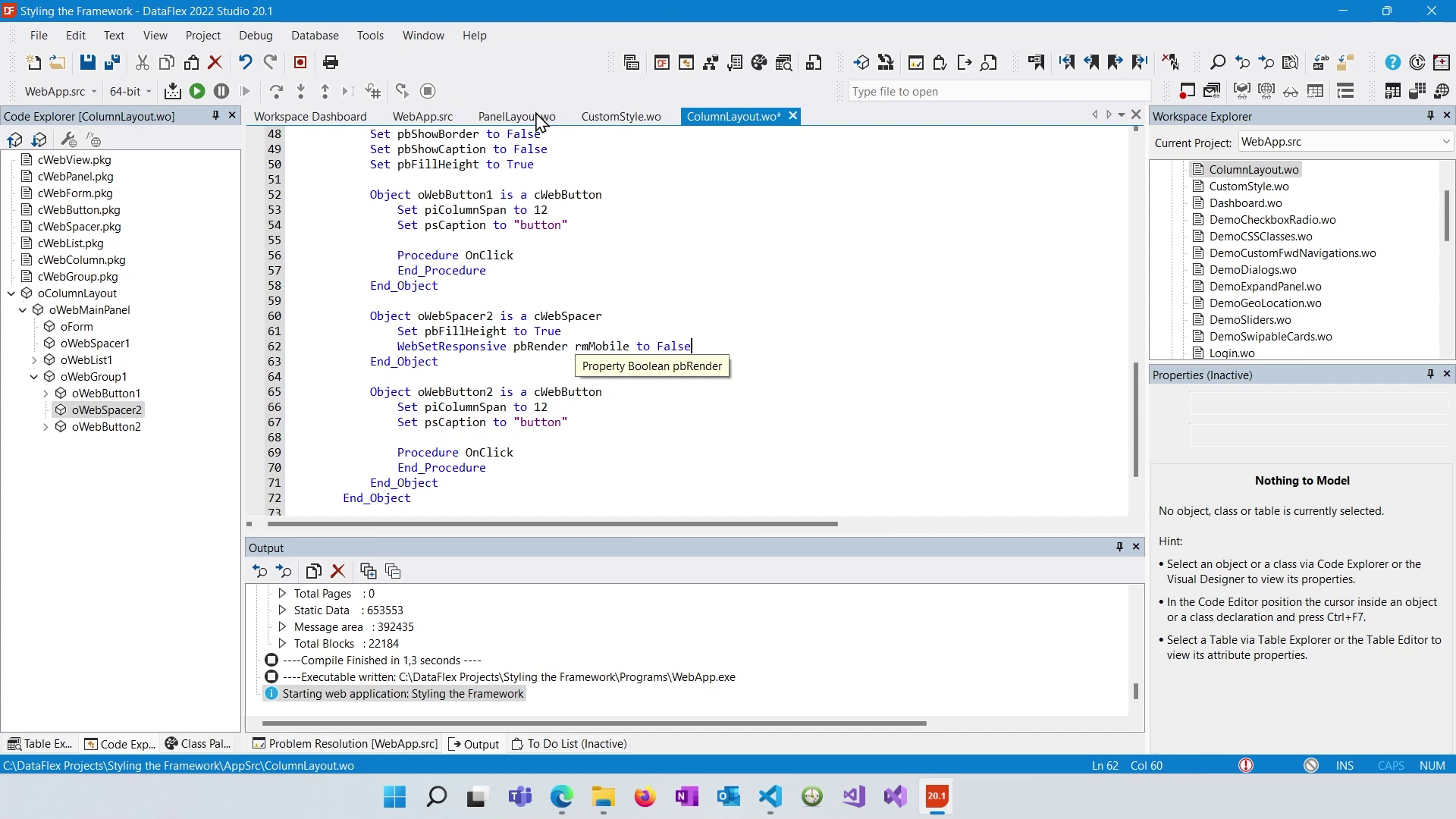
Now the spacer element hides on mobile:
Control the height filling behavior by adjusting the "WebSetResponsive pbFillHeight to False" property based on responsive modes. This helps you create cleaner and more optimized layouts.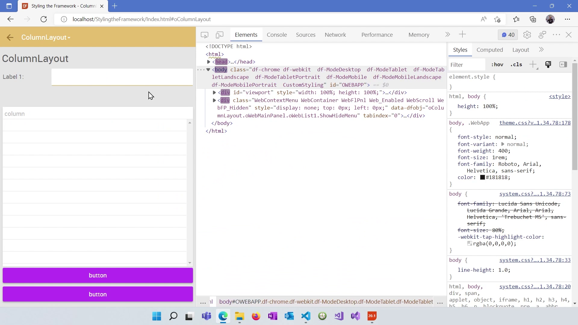
You've learned how to leverage the responsive design features in DataFlex to create adaptive web applications. In the next lesson, we will dive into working with lists and grids within the Framework.
