
 REFERENCE LIBRARY


In this lesson, we will explore the Panel Layout System, which provides an alternative to the Column Layout System in DataFlex. Panel layouts can be used independently or in conjunction with column layouts, offering greater flexibility in arranging controls within your web application.
In DataFlex, the container (either the main container or a panel) can use either the Panel Layout System or the Column Layout System. You can nest panels within other panels, creating a hierarchy. The primary concept of the Panel Layout System is to have a center panel with optional top, bottom, left, and right panels.
The top panel always spans the full width of its parent container. Even if you have left and top panels, the top panel will extend above the left panel. The same applies to the right and bottom panels. If this behavior is not desired, you may need a more complex panel structure.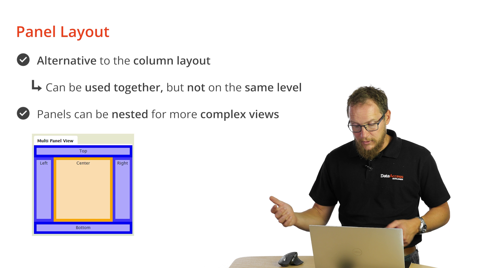
You can create resizable panels that allow end-users to adjust their size by dragging a handle. This provides a flexible way to create rich and interactive layouts.
Begin by adding a new Web View to your DataFlex application, calling it "PanelLayout." Use a default view template. The view template already includes a web main panel, which serves as the center panel.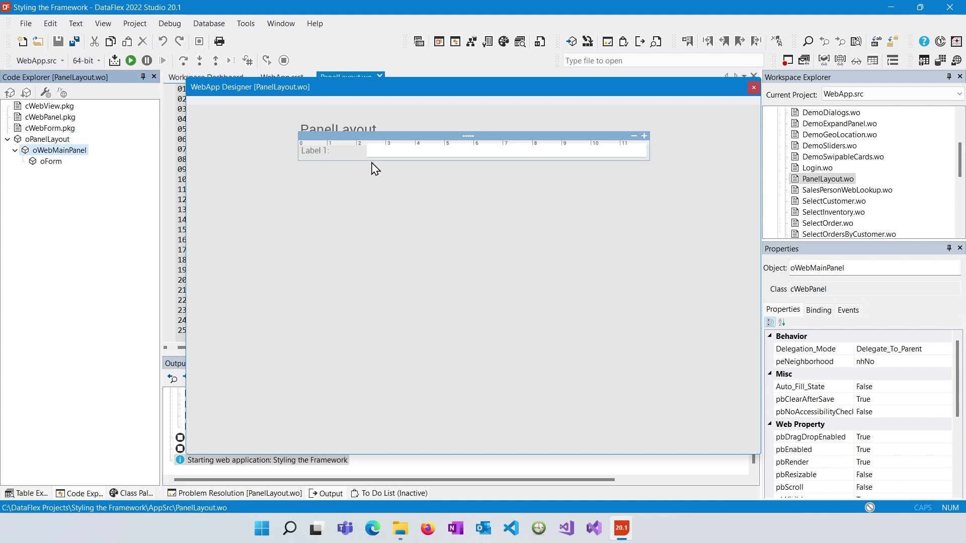
To create panels, access the class palette and drag panels onto your view. For instance, you can add a left panel. By default, the panels will span the full height of the view.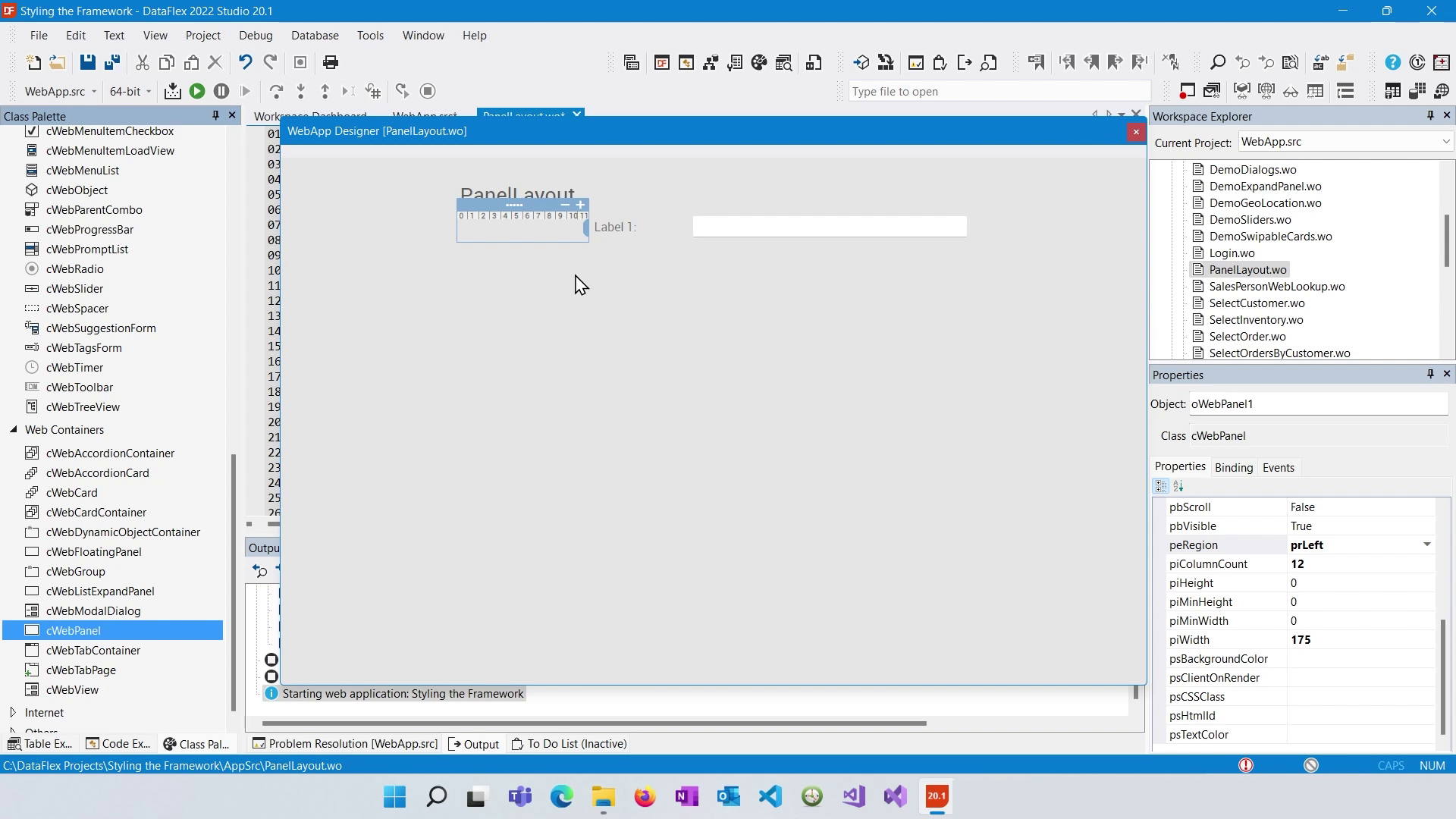
To modify the height of panels, you can set specific heights or use a spacer to stretch the panel to full height. A spacer with "pbFillHeight" set to true can make the panel expand to the available space.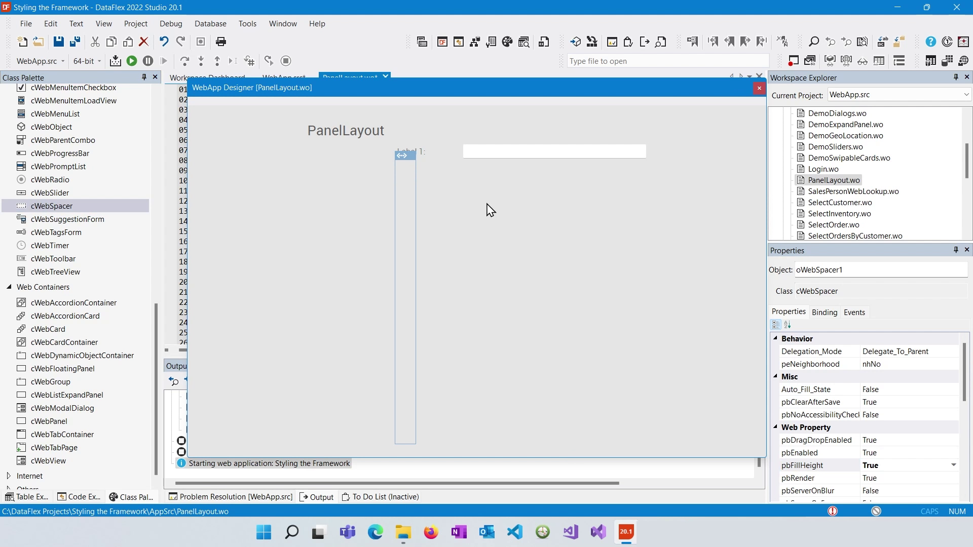
You can enhance panel visibility by setting background colors to distinguish them visually within your layout.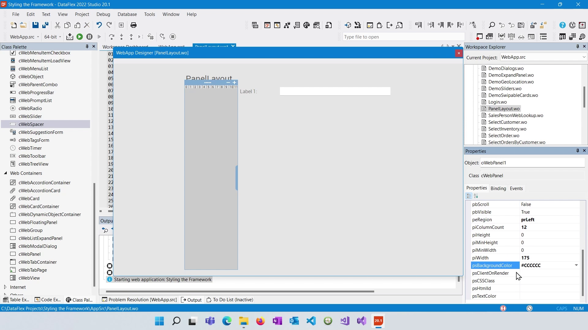
You can add controls to the panel, for example a treeview.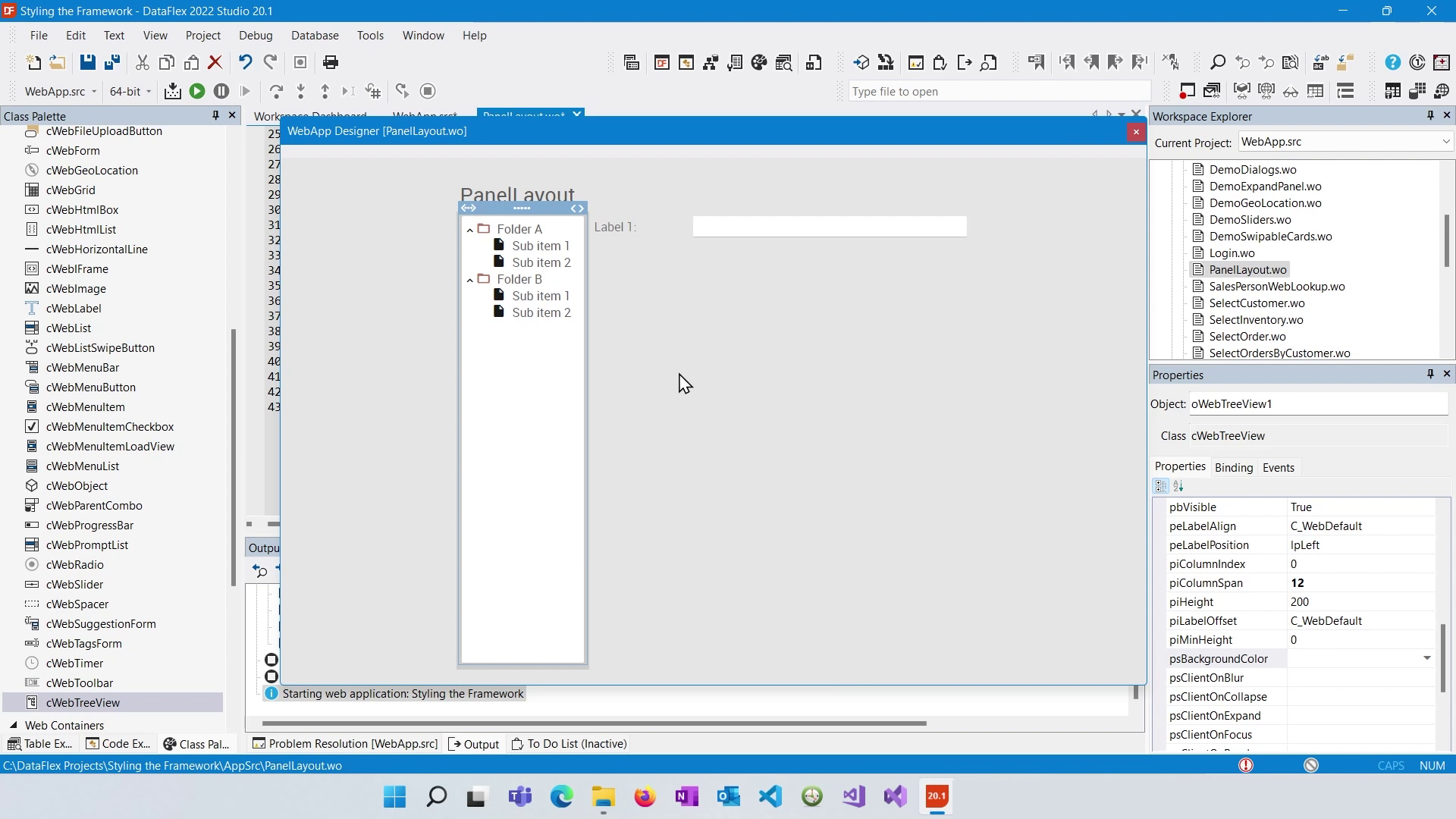
Nesting panels allows you to create more intricate layouts. You can have multiple panels within other panels, creating a hierarchical structure.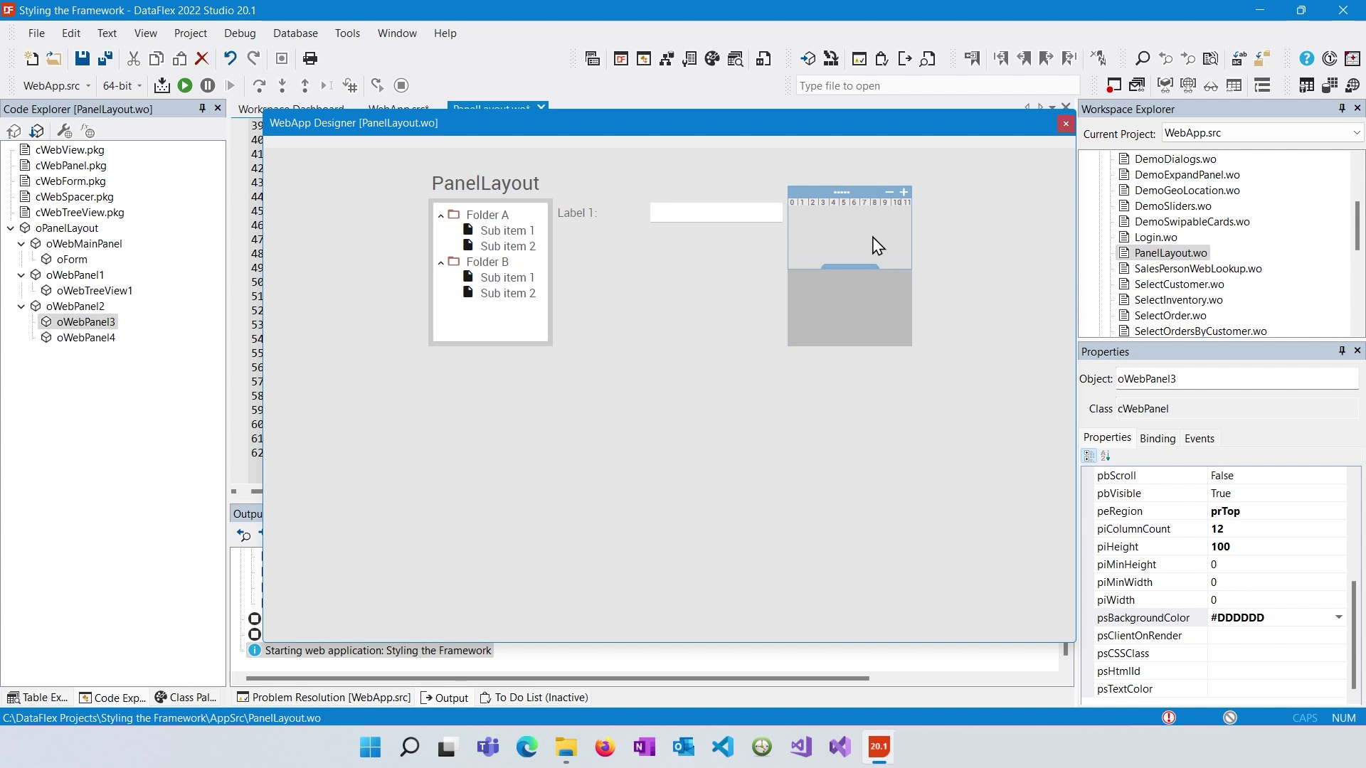
Top and Bottom panels size to their content.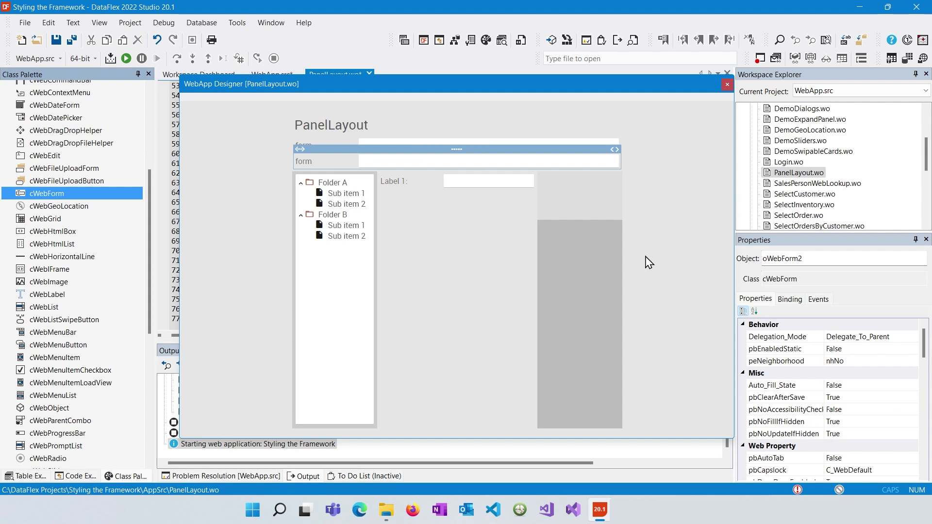
To make a panel resizable, set the "pbResizable" property to true. This will add a resizable handle to the panel's border, allowing users to adjust its size dynamically.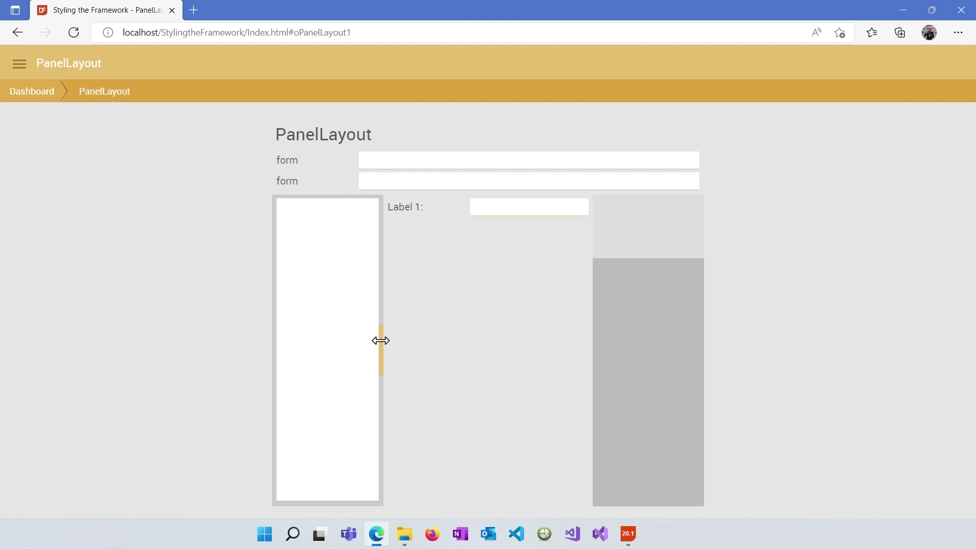
You can set "PI min width" and "PI max width" properties to control the minimum and maximum widths a resizable panel can have when users drag the resize handle.
Understand that panel layouts in DataFlex are translated into HTML and CSS structures. They consist of a hierarchy of div elements positioned using relative and absolute positioning, and their dimensions are controlled through inline styles.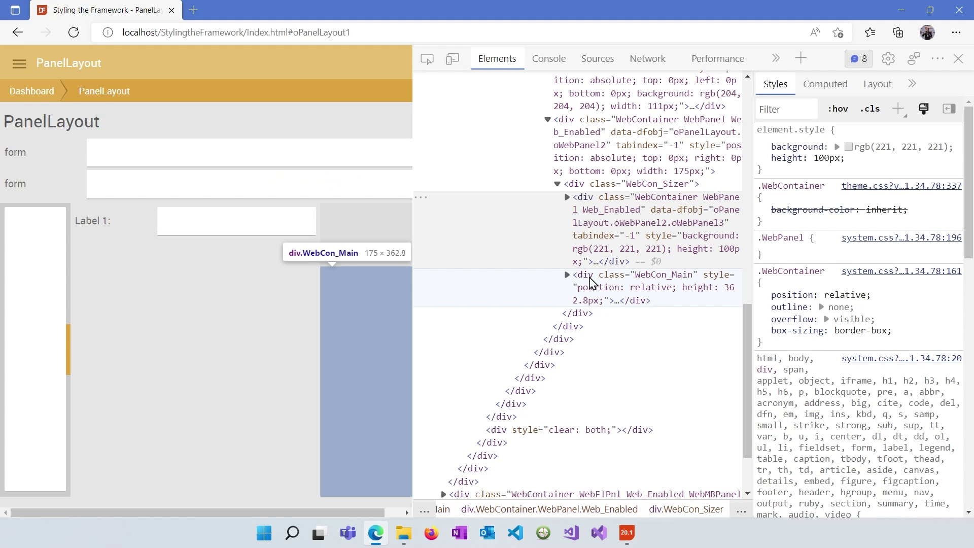
The DataFlex Panel Layout System provides a powerful way to create complex and responsive web application layouts. By understanding how to configure panels, nest them, make them resizable, and set heights, you can create versatile and visually appealing user interfaces. In the next lesson, we will dive deeper into working with individual controls within these layouts.
