
 REFERENCE LIBRARY


Before we dive into how the concepts, discussed in previous lessons, are applied within the framework, let's explore some key aspects of CSS related to sizing and positioning. These concepts are essential for understanding how elements are laid out on a web page.
HTML elements can be thought of as boxes with distinct areas:
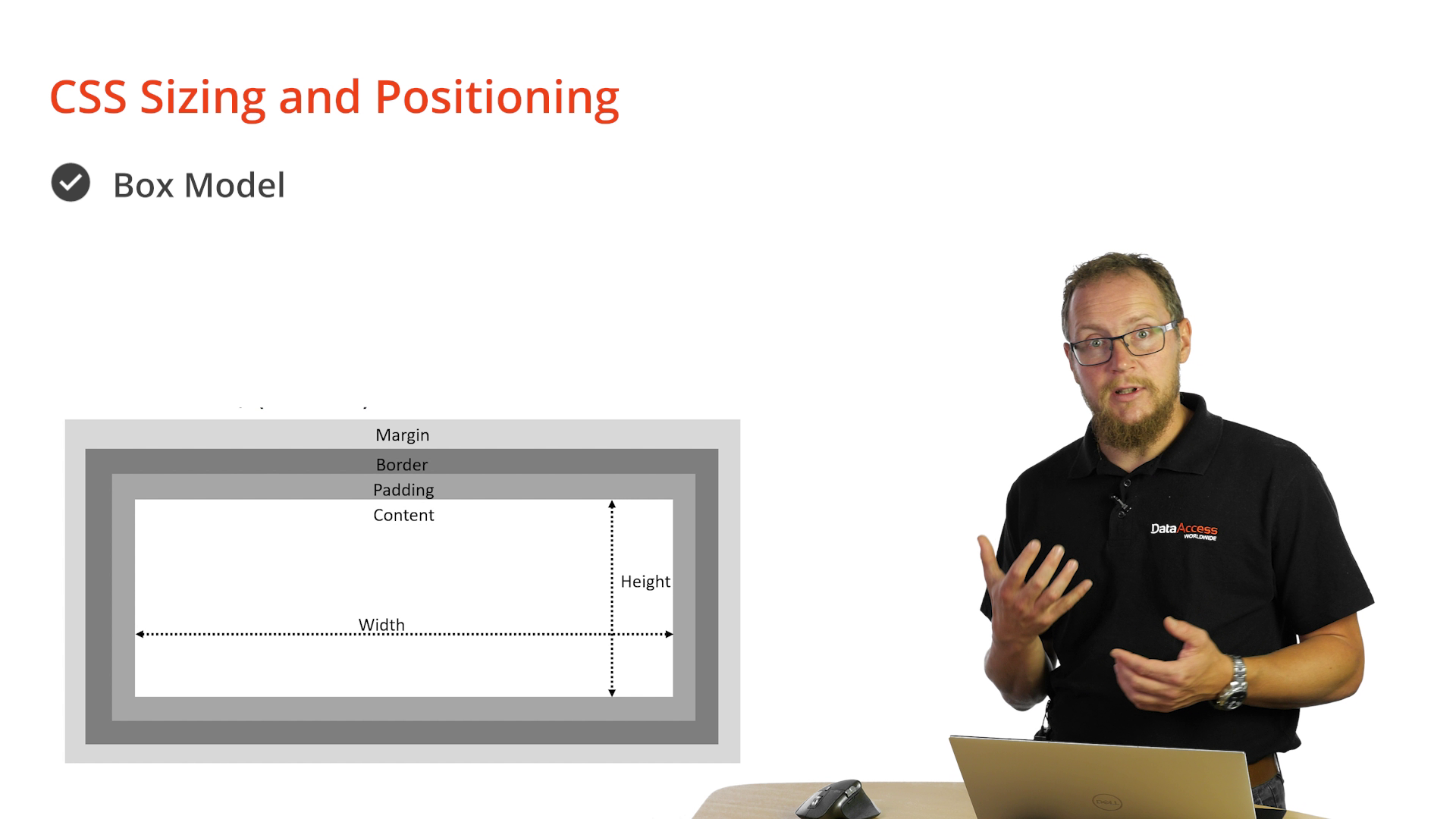 Impact on Width and Height
 When you set the width or height of an element (e.g., width: 20px), you're specifying the dimensions of the content area. However, keep in mind that the element's total size is influenced by padding, border, and margin. So, it occupies more space than just the specified dimensions.
The box-sizing property determines how an element's width and height are calculated. By default, it's set to content-box, which calculates dimensions based on the content area only. However, you can change it to border-box, where the specified width includes both the border and padding.
For instance, if you set a width of 20px on an element with a 1px border and 2px padding, the total width will be less than 20 pixels if box-sizing is set to border-box.
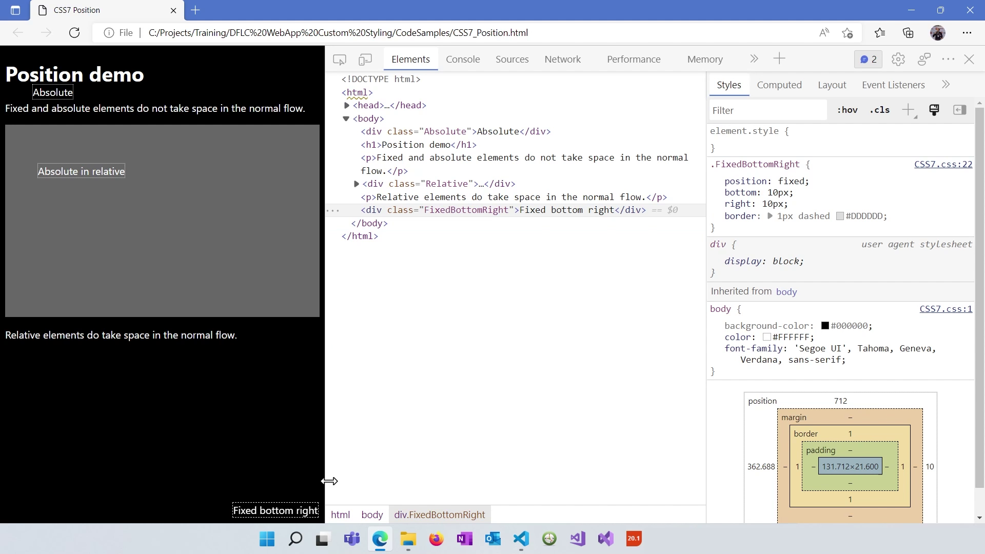
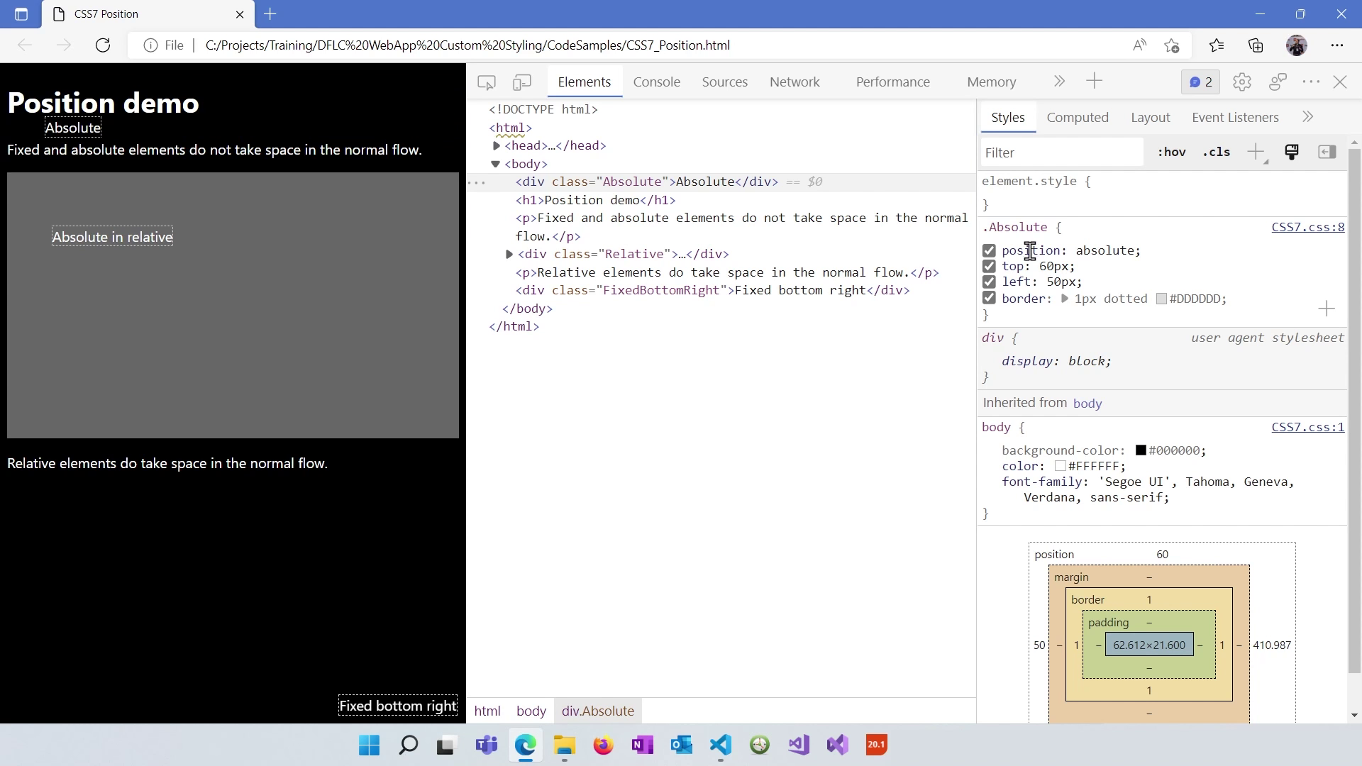
The position attribute controls how an element positions itself within the layout. Several values are available:
Examples of Positioning
Illustrative examples help understand how positioning works:
The display attribute determines how an element is rendered in the layout. Common values include:
Understanding Float
The float property allows elements to float left or right within their parent container, affecting their positioning. The clear property ensures that no elements float next to a floated element.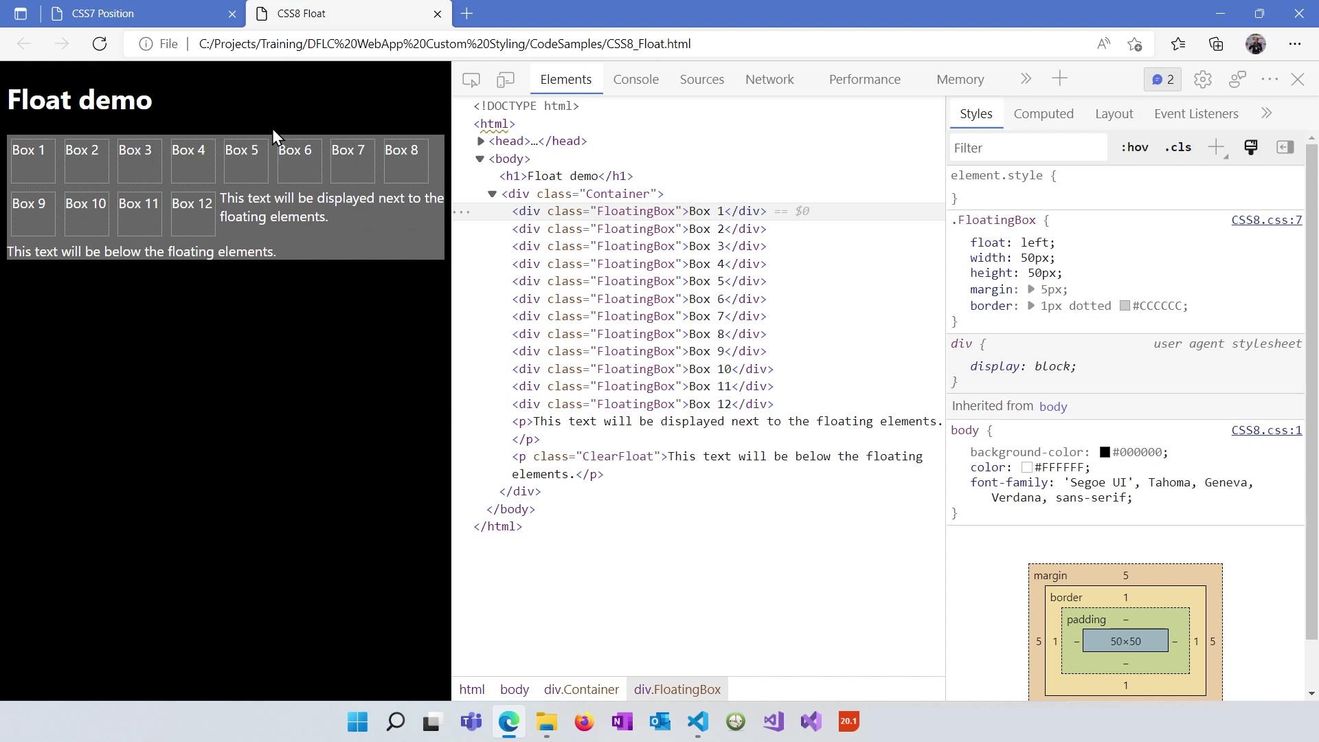
You can experiment with CSS in developer tools, enabling you to make real-time style changes and visualize their effects on the page. However, these changes are temporary and should be copied to your actual stylesheet if desired.
With a solid grasp of these CSS sizing and positioning concepts, you're better prepared to understand how they are utilized within the framework's structure. In our next lesson, we'll explore the framework's architecture and see how these concepts come together to build web applications. Stay tuned!
