
 REFERENCE LIBRARY


In this lesson, we'll explore how controls are constructed in DataFlex, including their elements and how to apply styles to them.
DataFlex sets certain inline styles for controls, making them challenging to override. These inline styles are primarily controlled by control properties that map to CSS properties.
Some control properties map directly to inline styles, such as:
These properties are used to style controls in the browser.
Controls in DataFlex generate a specific CSS structure. The outermost div element always has the class ."WebControl" but additional classes are added based on the control type. The hierarchy of nested class names is crucial for styling.
Each control in DataFlex typically has a label associated with it. The styles for labels are defined on the ".WebControl" class.
Controls can be enabled or disabled. Use the ".Web_Enabled" and ".Web_Disabled" classes to style these states differently.
To style controls that have focus, use the ".WebCon_Focus" class. This allows you to change the appearance of controls when they are selected.
DataFlex controls offer a "psCSSClass" property that allows you to apply custom CSS classes to the outermost div element of a control. This enables you to create custom styles.
Add another view 'Custom Style'. We're adding a button.
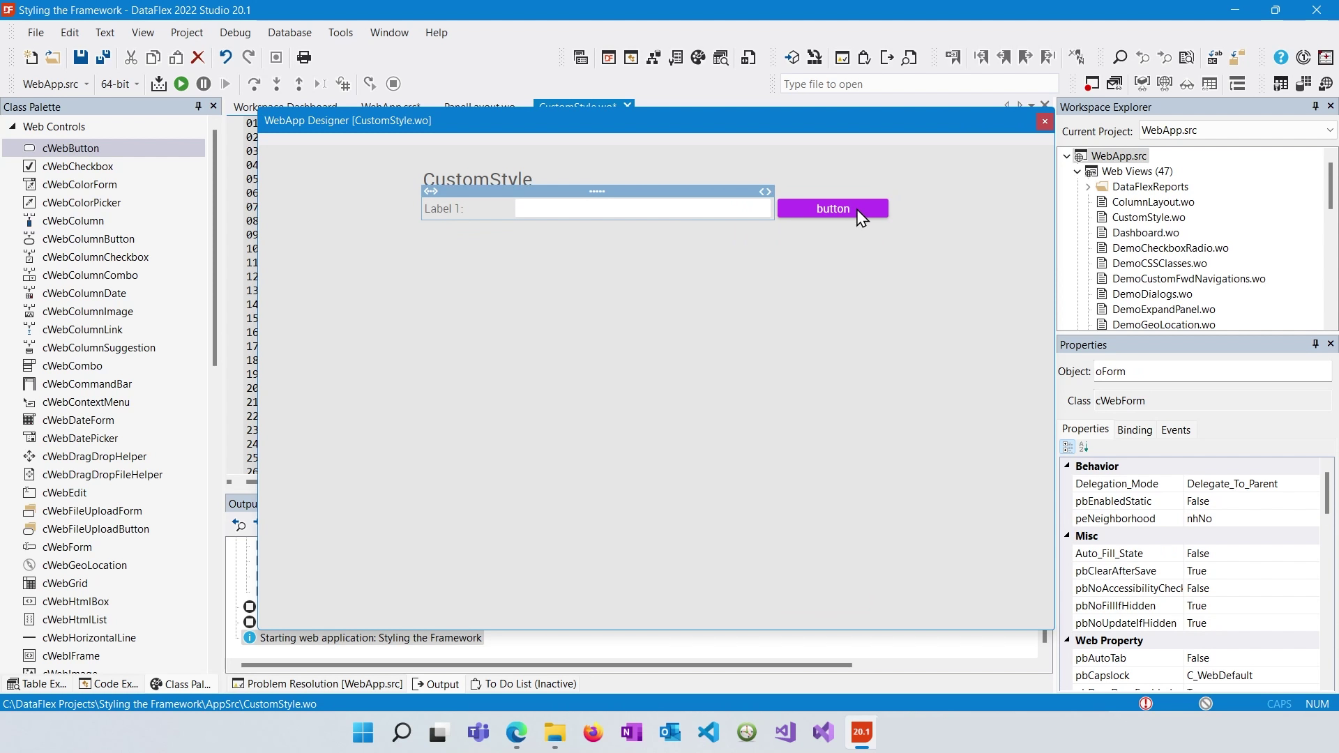
Set a psCSSClass to BtnWarn.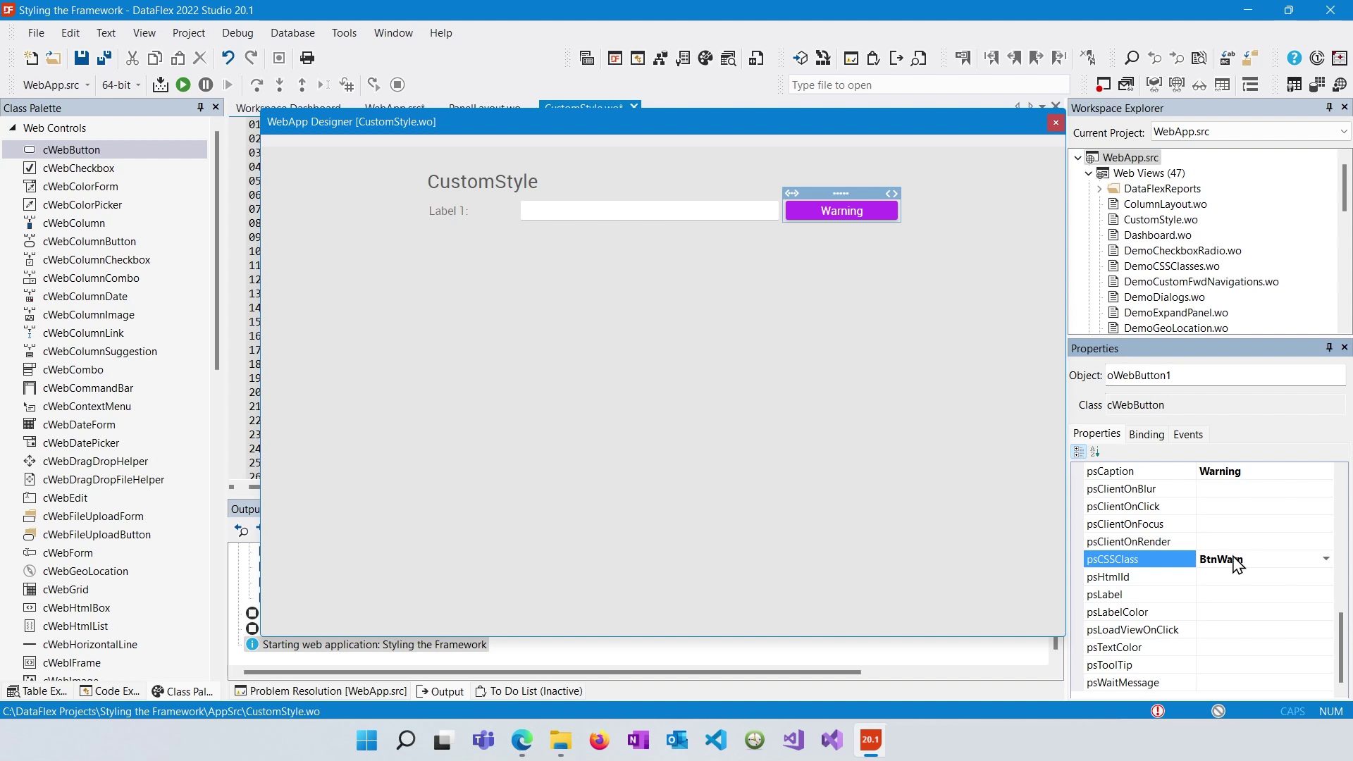
Open the AppHTML with VisualStudioCode.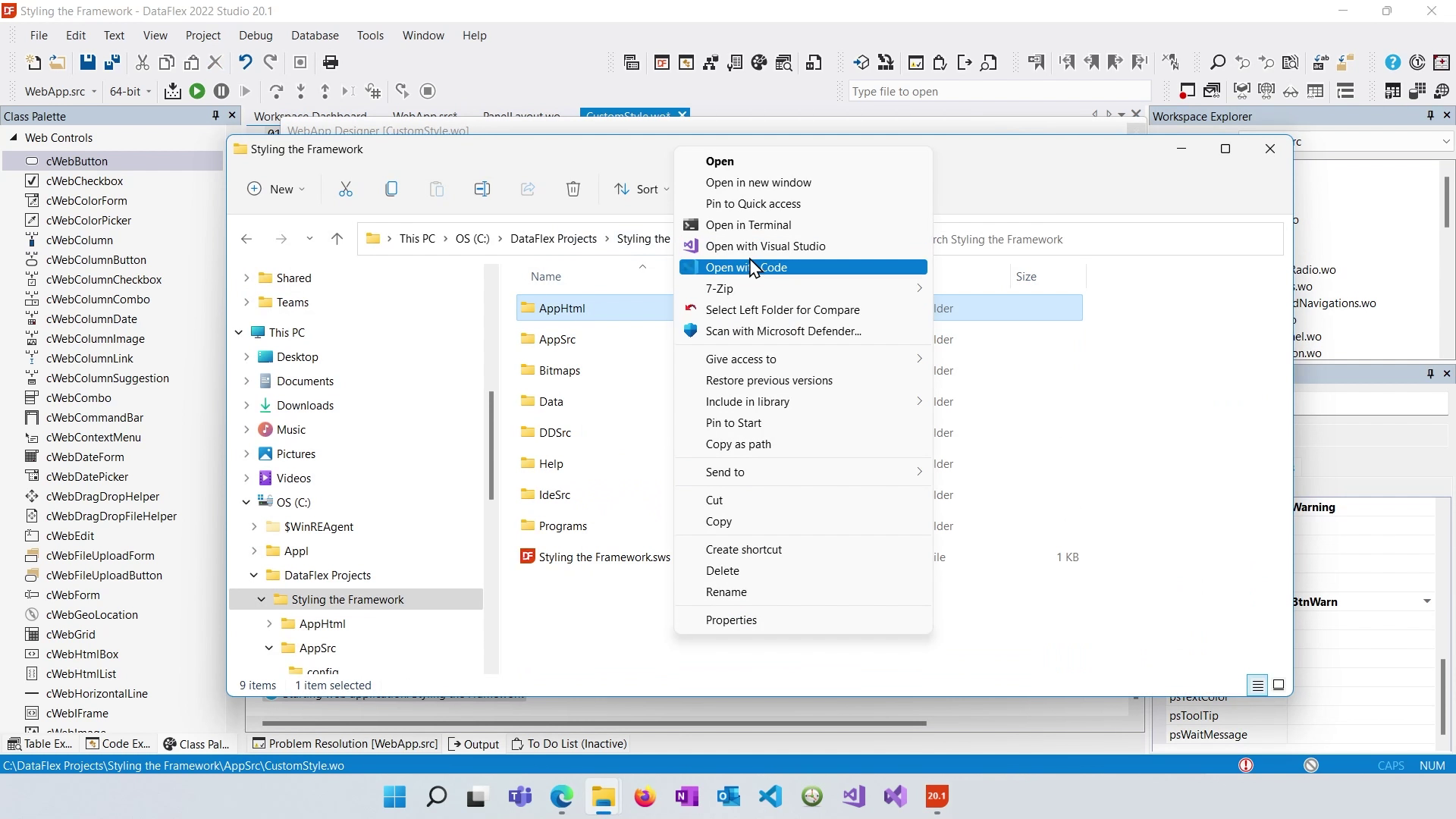
Open "application.css". Define styles for your custom CSS classes or control-specific selectors based on the class names and elements you want to target.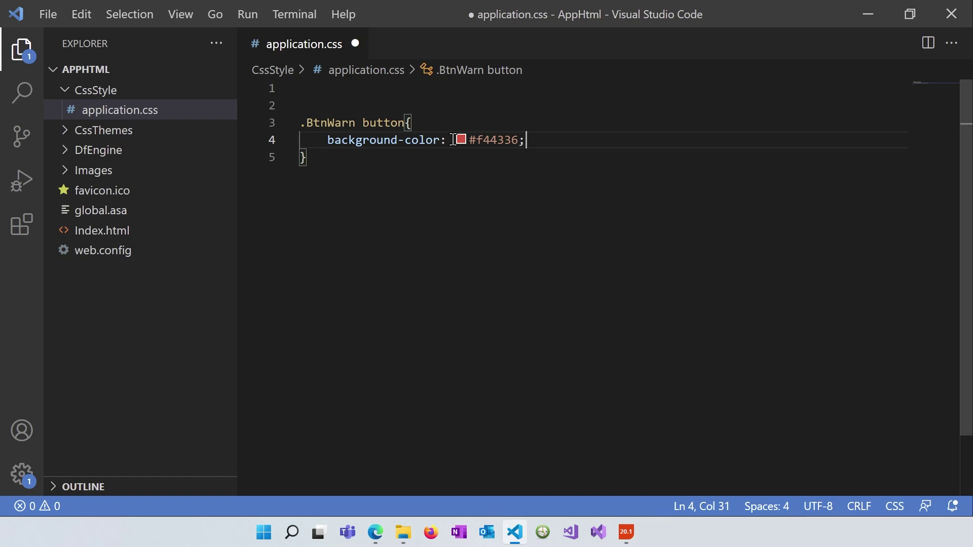
After creating custom styles in your "application.css" file, save it and ensure that the designer reflects the changes by right-clicking on the designer area and selecting "Refresh."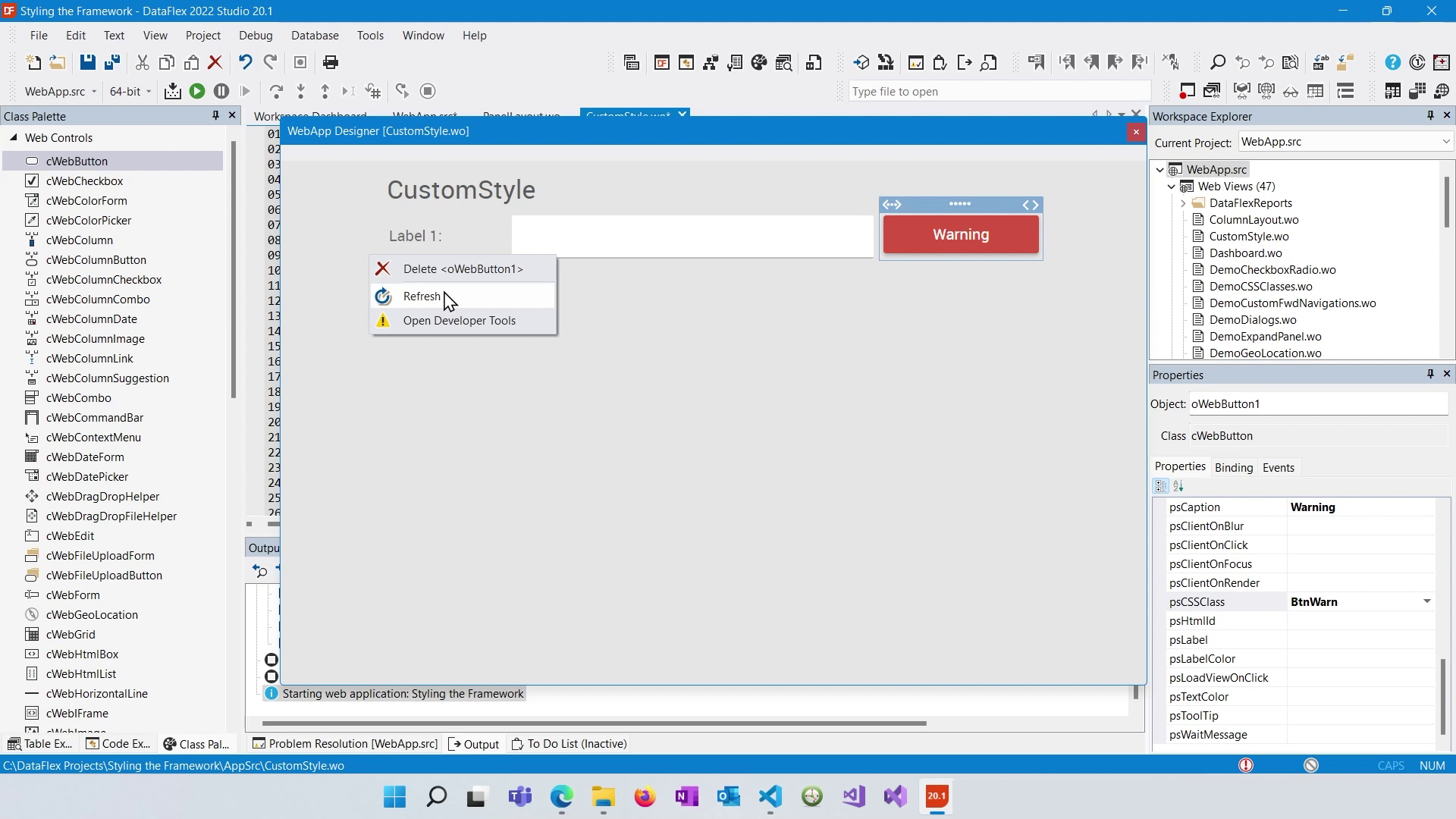
When creating custom styles, ensure that your selectors are more specific than the default styles to override them. Adding more class names to your selectors increases specificity.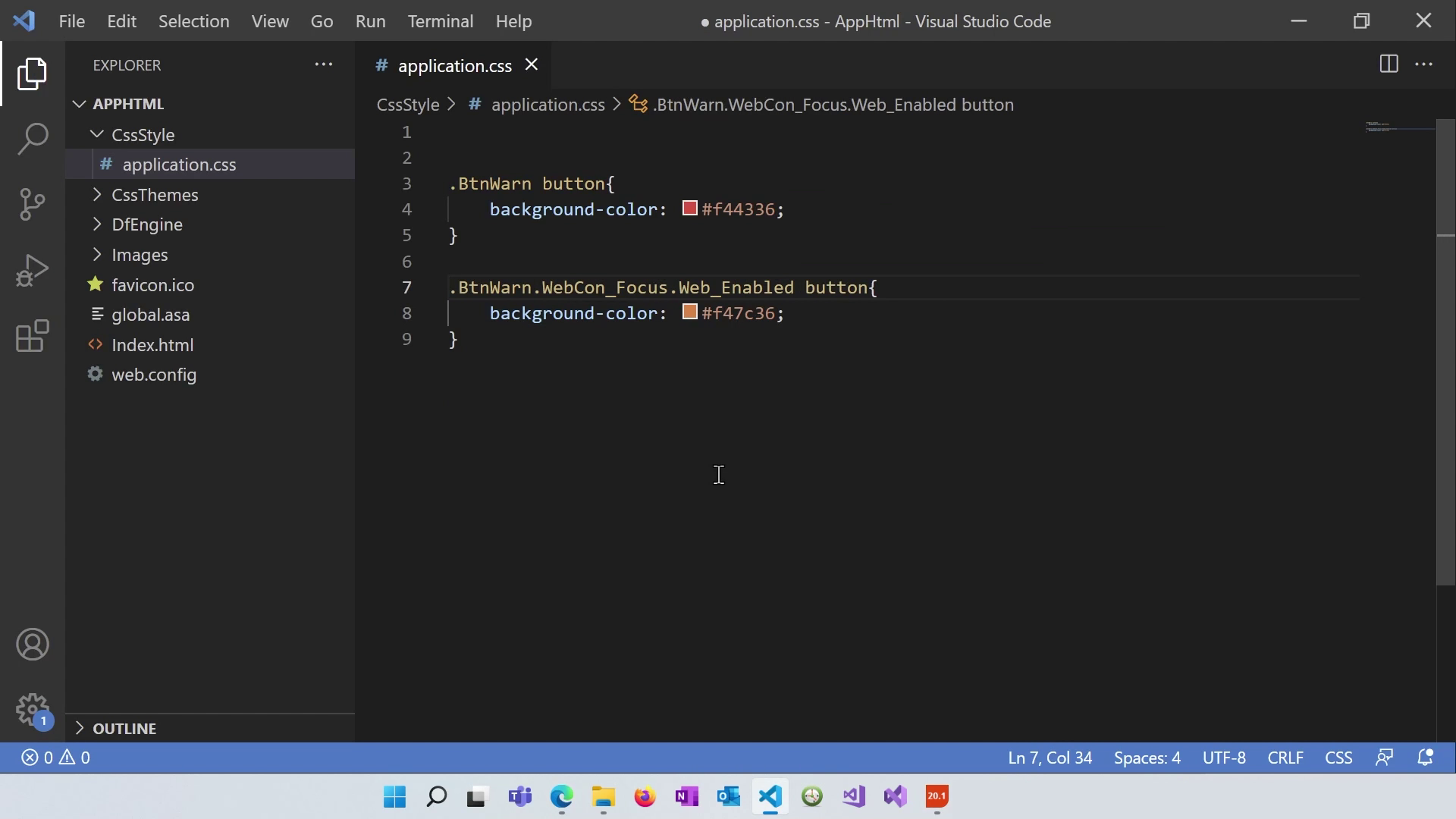
To prevent browser caching issues while testing your custom styles, open the developer tools in your browser, go to the network tab, and check "Disable cache." This ensures your styles are always refreshed when you reload the page.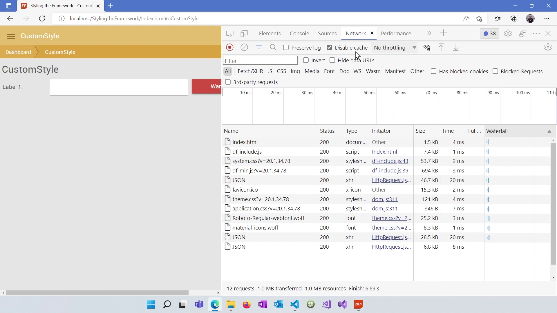
Inspect the control in your browser's developer tools to verify that your custom styles have taken precedence over default styles.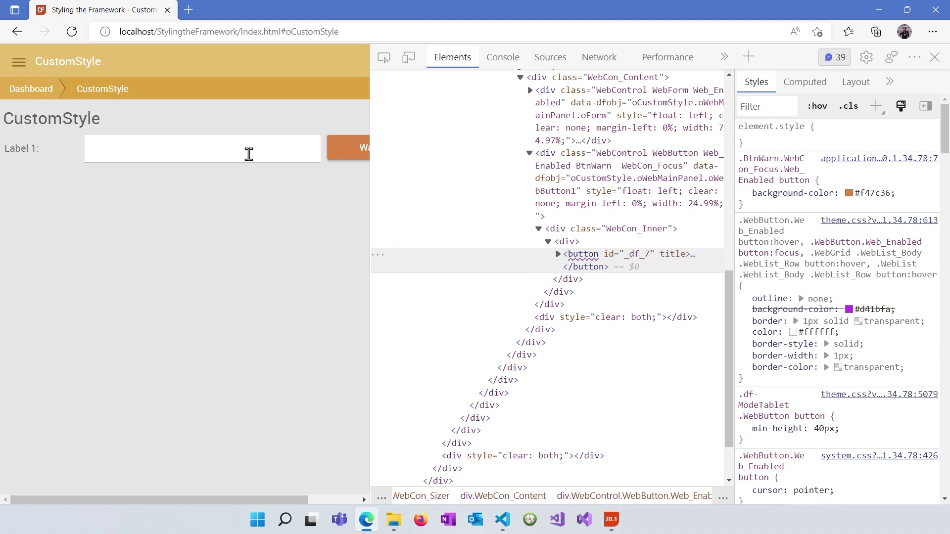
You've learned how to work with controls, apply inline styles, and create custom styles in DataFlex. In the next lesson, we'll delve into making your web applications responsive within the DataFlex Framework.
