
 REFERENCE LIBRARY


In this lesson, we will delve deeper into the Column Layout System, which is the standard layout system in the DataFlex Web Framework. This system employs a flow-based layout mechanism where controls are positioned within specific columns. Controls can span multiple columns, and the number of columns is adjustable. The layout flows automatically from left to right and top to bottom.
To explore the Column Layout System, start by adding a new view to your DataFlex workspace. You can use the "web view" template and select "Column Layout."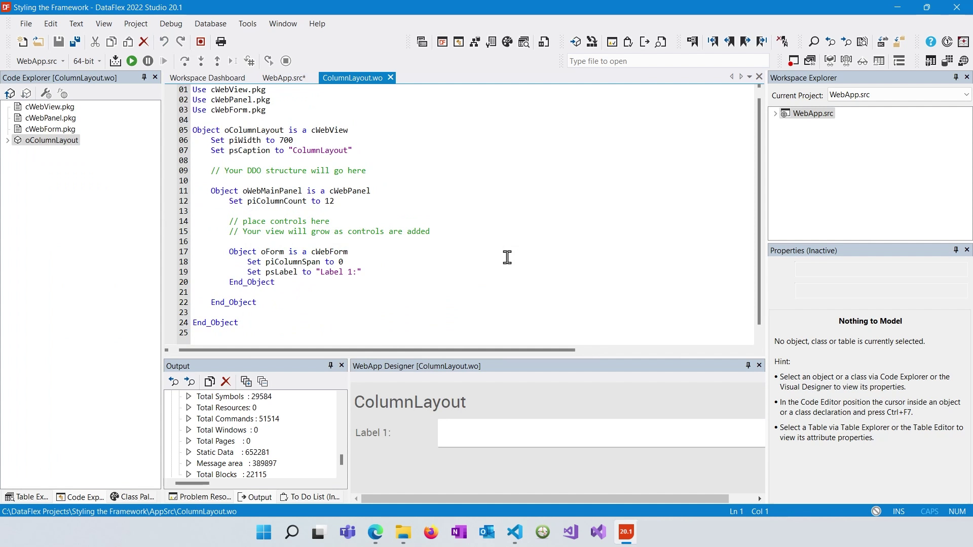
We open the WebApp Designer. Upon creating the view, you will notice that a form has already been generated. This form is contained within a panel. While this panel is optional, it is included to make it easier to add extra panels if needed.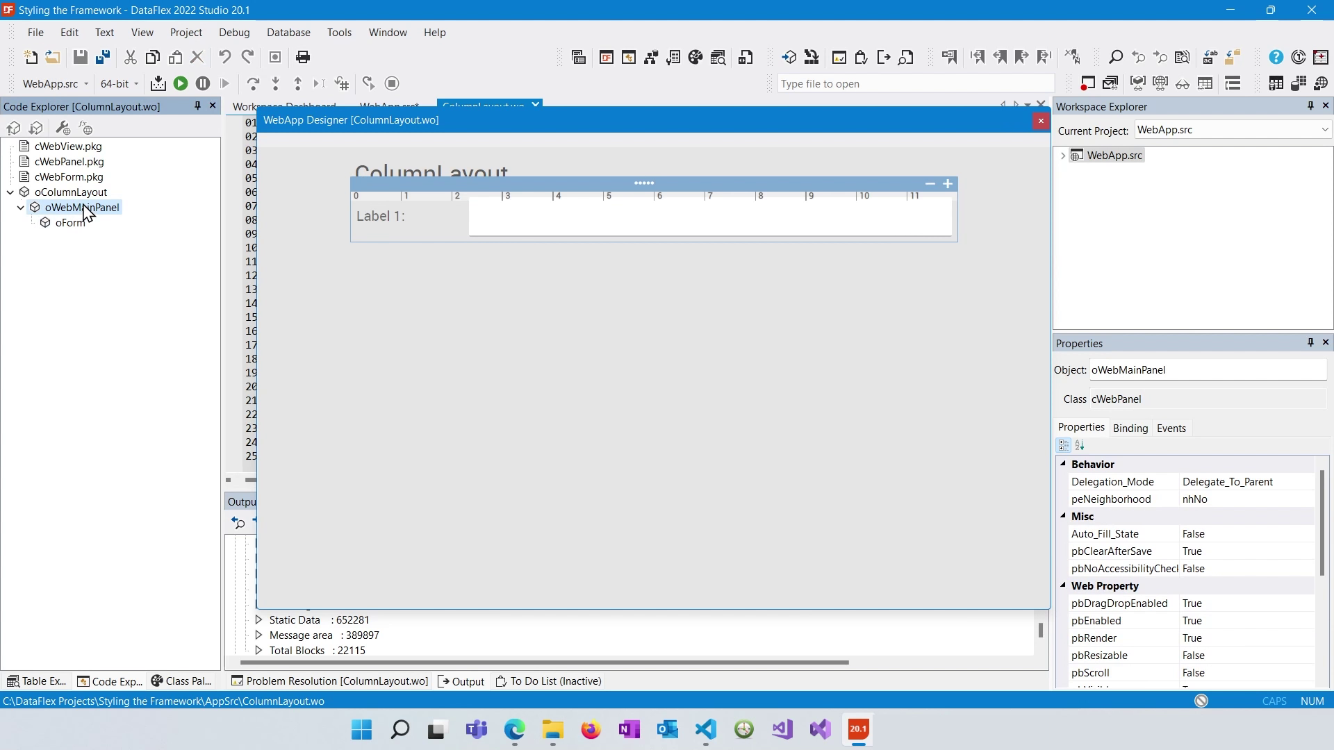
To configure columns, select the panel. You will see a bar at the top of the panel that represents the columns. In this case, there are 12 columns numbered from 0 to 11. You can adjust the number of columns using the plus and minus signs.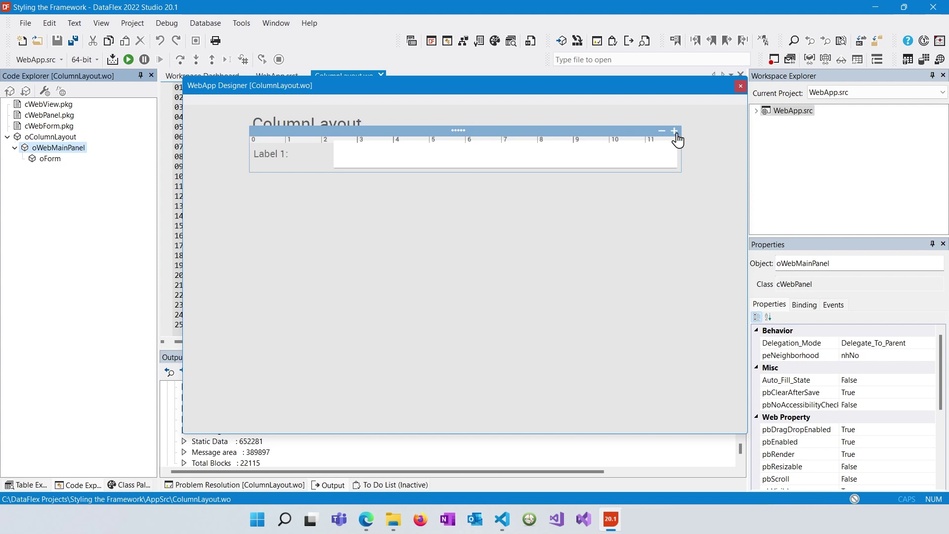
The main feature of the Column Layout System is the ability to position controls within the columns. To do this, drag and drop controls from the class palette onto the panel. As you move controls, you will see an indicator showing where they will be placed in relation to existing controls.
By default, controls have a column span of 0 (spanning all available columns to the right) and a column index of 0 (starting from the first column). You can adjust these settings to control how controls are positioned within the columns. Dragging controls horizontally changes their column index, and adjusting their width changes their column span.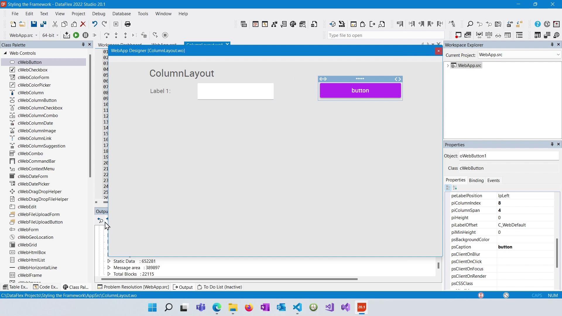
To create white space or push controls to the next line, you can use spacers. Spacers are invisible controls that affect layout. Drag a spacer from the class palette onto your view, and you can position it relative to other controls. It will push controls down or create space between them.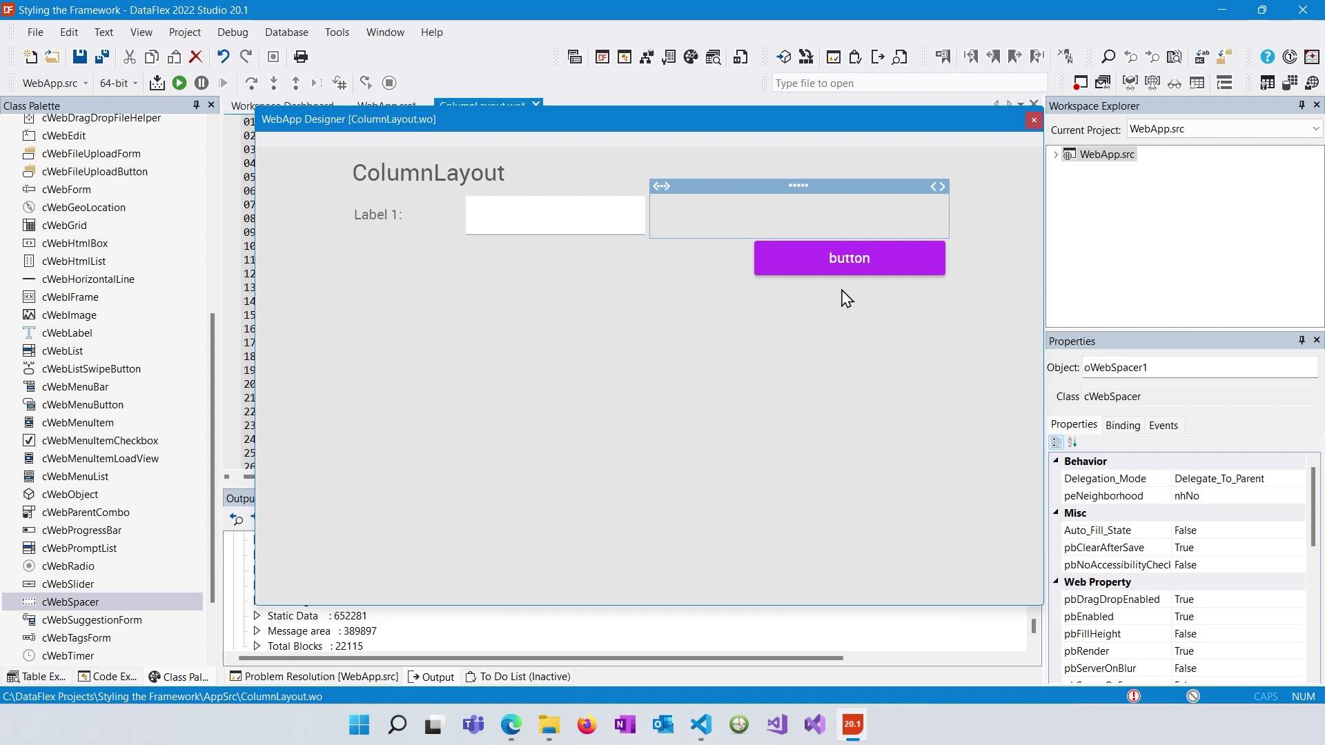
Some controls, like lists, have variable heights. You can set their height by using piHeight or use the "pbFillHeight" property to make them expand to fill available space. You can also set a minimum height to prevent controls from becoming too small (piMinHeight).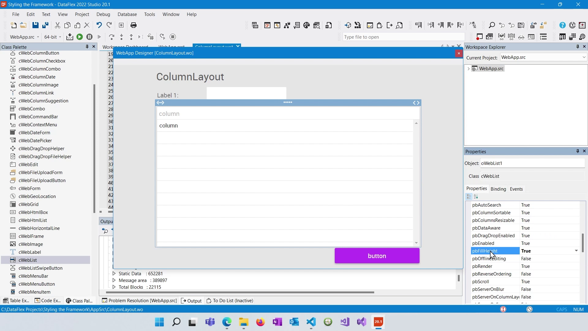
Groups (Web Containers cWebGroup) can be used to group controls together for layout purposes. They can be made invisible by setting "pbShowBorder" and "pbShowCaption" to false. Groups are useful for managing the layout of multiple controls together, especially when you want to align controls horizontally.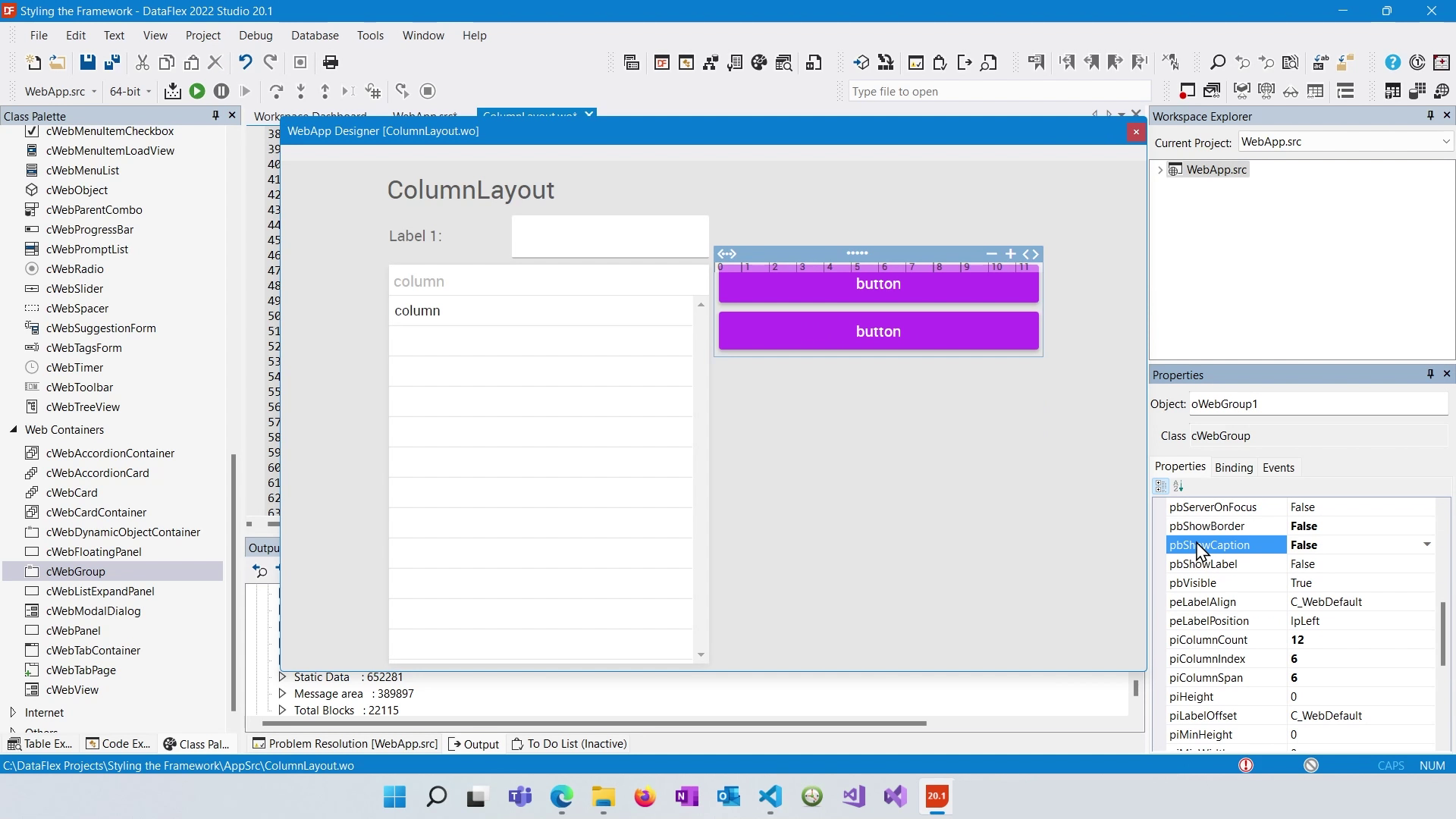
After configuring your column layout, compile your project and run it. You will see the controls positioned as per your settings. Remember that the Column Layout System uses CSS for rendering, and it sets various CSS properties such as float, clear, margin, width, and height based on your column configurations.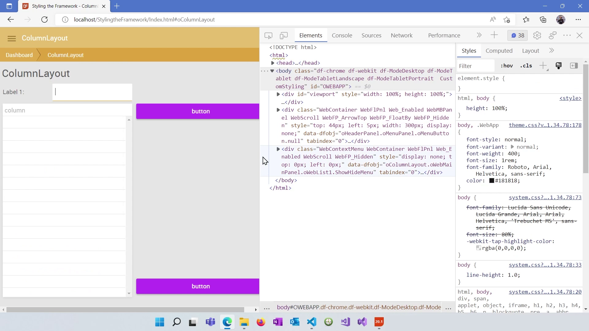
The Column Layout System in DataFlex offers a flexible way to arrange controls in your web applications. Understanding how to use columns, adjust spans and positions, work with spacers, and utilize groups will help you create well-structured and visually appealing layouts. In the next lesson, we will explore the Panel Layout System.
