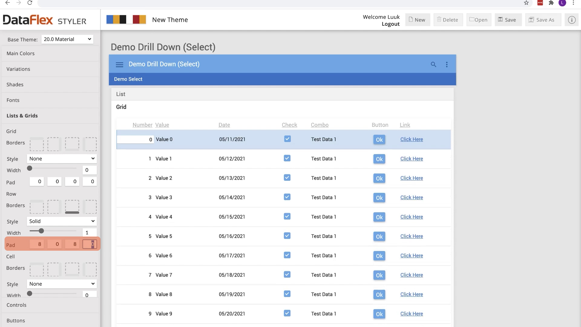
Let’s start with the lists. To make sure the data list has a good readability we use the styler to add whitespace to the top and bottom of a row
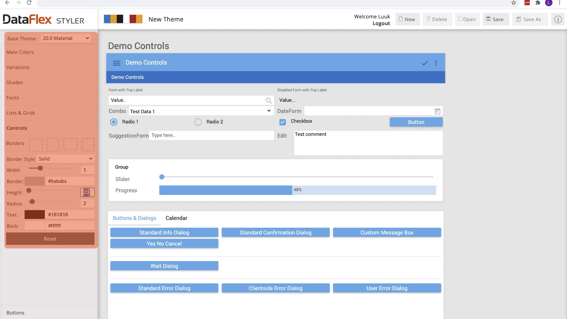
Let’s change the border style and make improvements to the Views!
To make sure our views are easy to use by our users we give our view controls a minimum height of 42 pixels and a border radius. This way our views are spotted easily
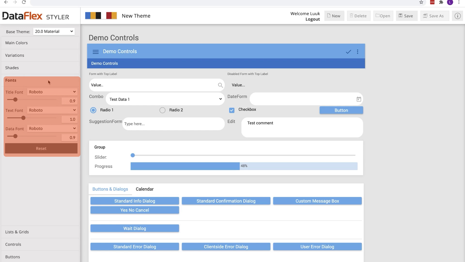
Let’s change the font for our data text to roboto, this font works in various sizes and has a better readability. This font is also available on all devices
Well that looks a bit off. We also have to change the font for titles and text
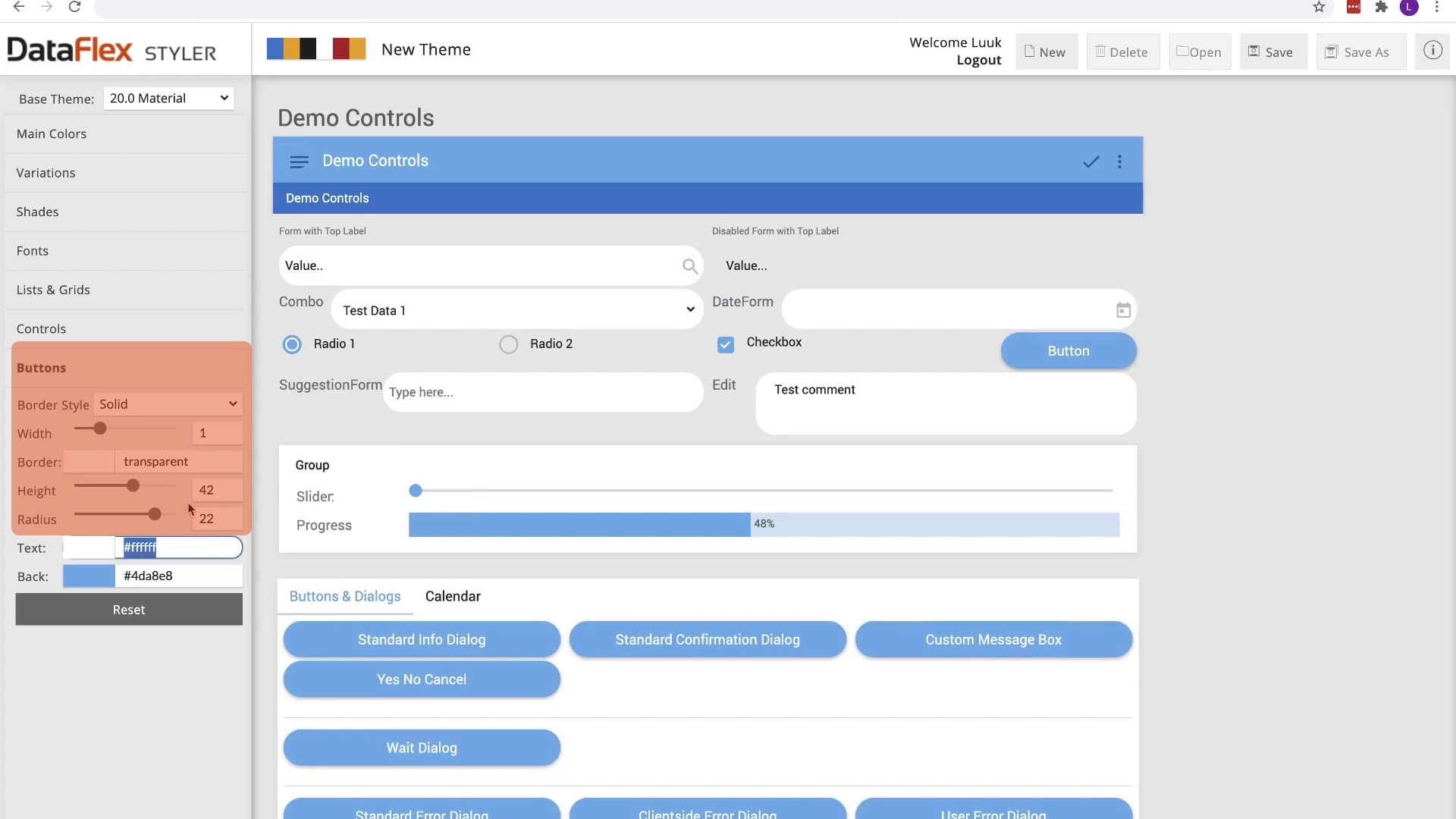
Better! Let’s improve the Buttons!
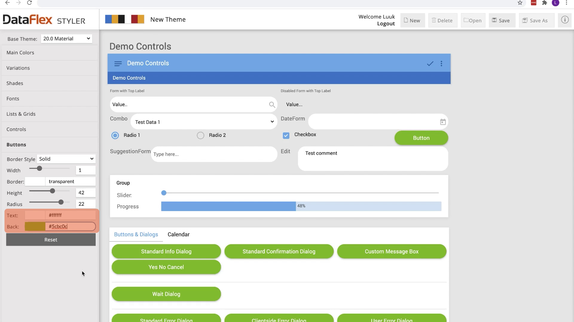
It is important to make our buttons look clickable. Let’s change the button height to 42 pixels and give it a border radius to make them do look clickable.
That looks okay buttons, but they don’t stand out.
Let’s change their background color! Well that is clickable button.
So that were the new features of the updated DataFlex Styler!
In this lesson we’ve created a new theme, based upon the new features in the DataFlex Styler. Let’s see how to implement this theme into DataFlex